Problem and Solution Overview
The problem we wanted our design to address is the confusion and lack of communication within housing communities. We specifically decided to focus on the lack of social engagement within the residential experience as a barrier for understanding aspects of the housing process due to the lack of communication with administration, facilities, and others in your housing community. While there are spaces across campus for gatherings that can better the residential experience, they are often underutilized and under promoted. The goal of RES is to increase knowledge of these events throughout a college campus to connect individuals within a housing community, and allow them to learn more about their living environments. We plan to achieve this through an event application where people can share events they are hosting and therefore notify others within that quad or neighborhood; facilities and housing authorities will also have access to the application and therefore be informed of these events as well.
Initial Paper Prototype
The two tasks we wanted to address in the initial paper prototype are:
- Browsing and Responding to an Event
- Creating a Social Space
Here is an overview of our mobile application. After logging in, users will be directed the home screen which is a map. Through the task bar at the bottom, the user will be able to complete the two tasks to their liking.
Original Task 1: Browsing and Responding to an Event
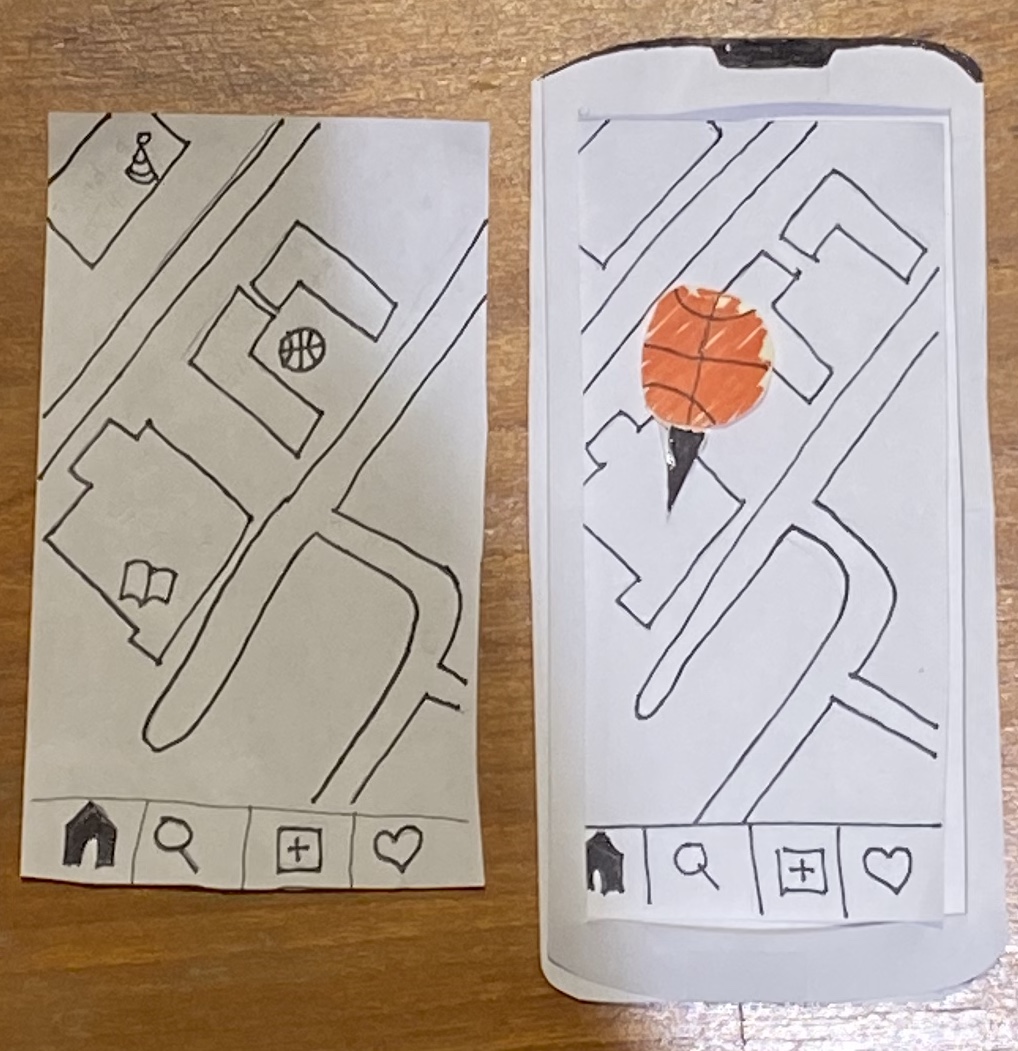
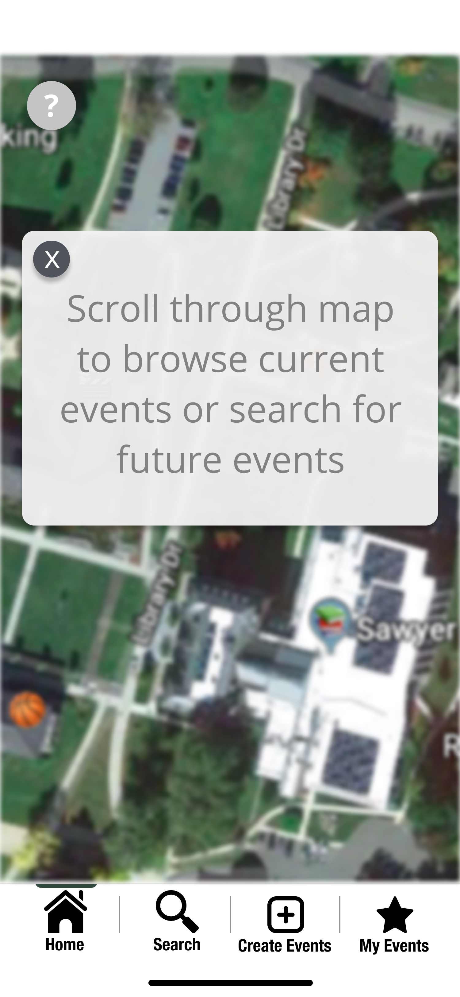
One way of browsing and responding to events is through the map displaying events that are currently happening on campus.
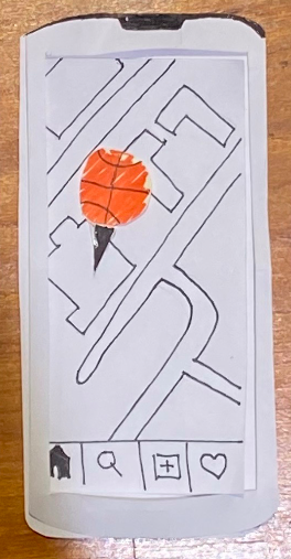
When a user first opens the application, they will see a map similar to the display on the left where there are small icons (emojis) throughout it representing different current events. As the user zooms in, these emojis will appear larger like the display on the right, allowing the option of more easily clicking on it
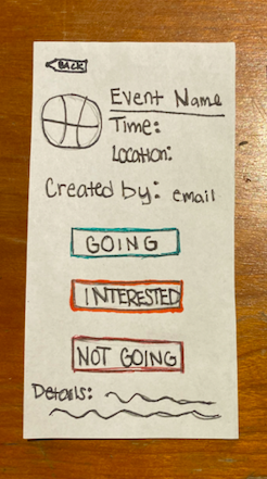
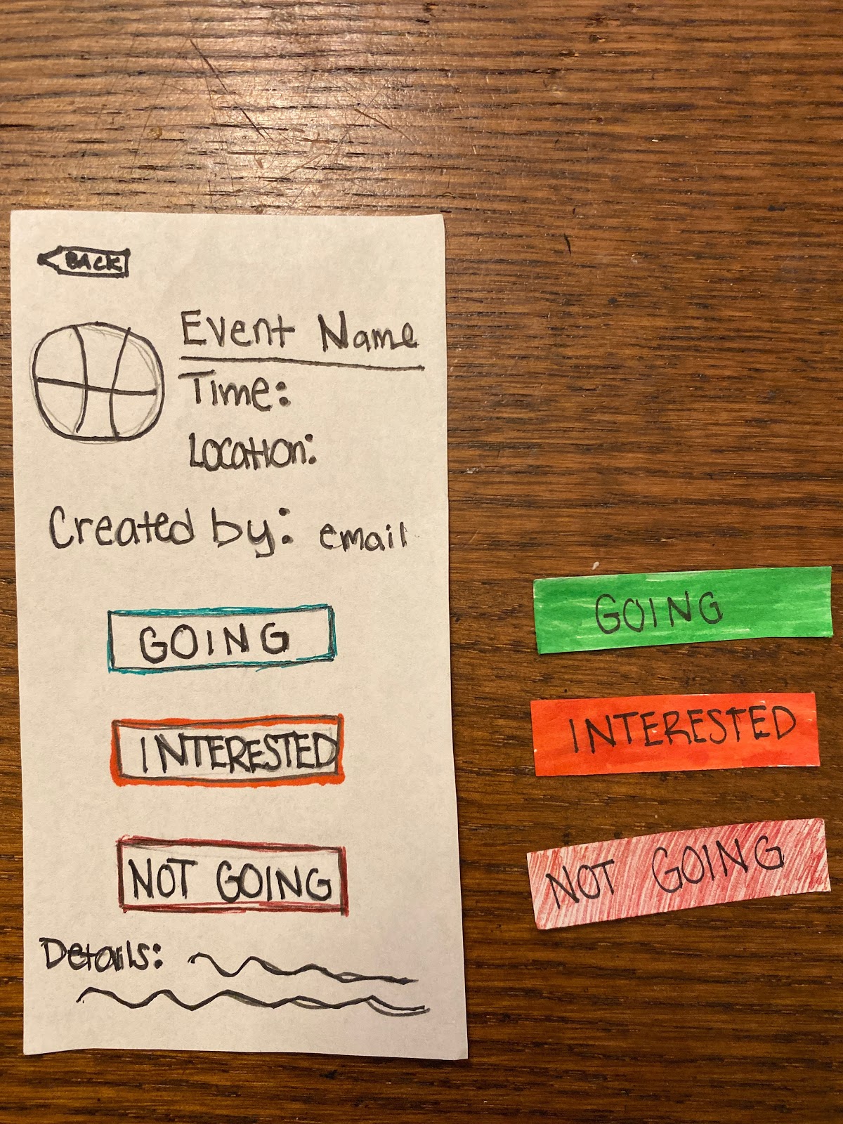
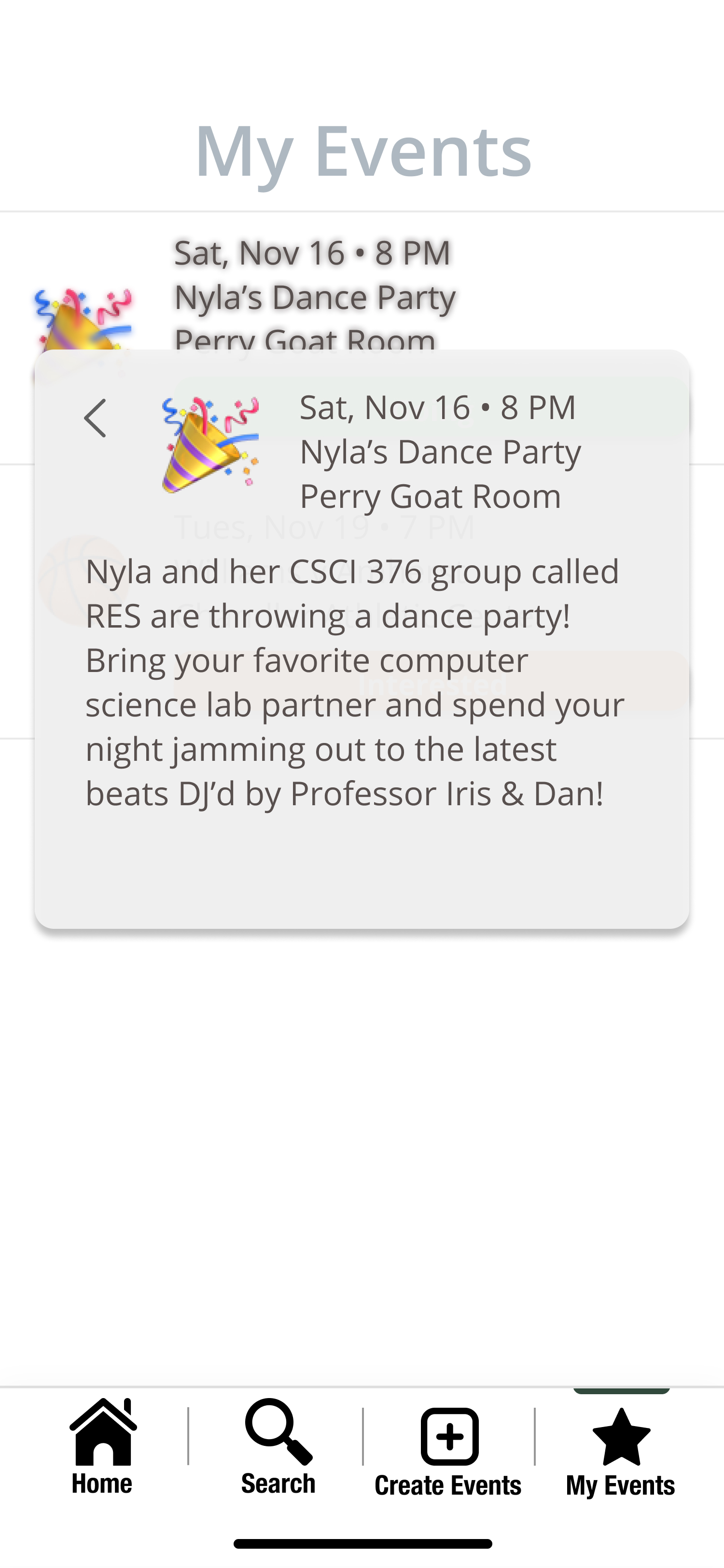
Once an emoji is clicked on, the user can see the corresponding event name, time, location, details, and creator. On this page, users will be able to respond “Going”, “Interested”, or “Not Going”. Once the user indicates their response by clicking on the appropriate button, it is highlighted with a corresponding color. If the user clicks “Going” or “Interested”, the event will be displayed on their “My Events” page. If the user clicks “Not Going”, the event will be deleted from their personal map and can only be found if searched for.
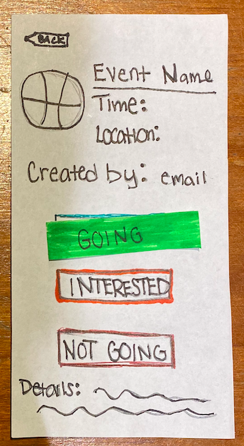
When a user clicks on an event on this page, it shows more information about the event and allows them to edit their responses. This page can also be accessed through the heart icon on the bottom of the application home screen.
Alternative screen if housing authority view (accept & reject): The housing authorities have a different view on their interface and it is labeled as “Events”. It displays all the events that are upcoming in time order. The approval status of the event is also shown. When the user clicks on the status of the event, they are able to disapprove of the event by submitting a reason for cancellation.
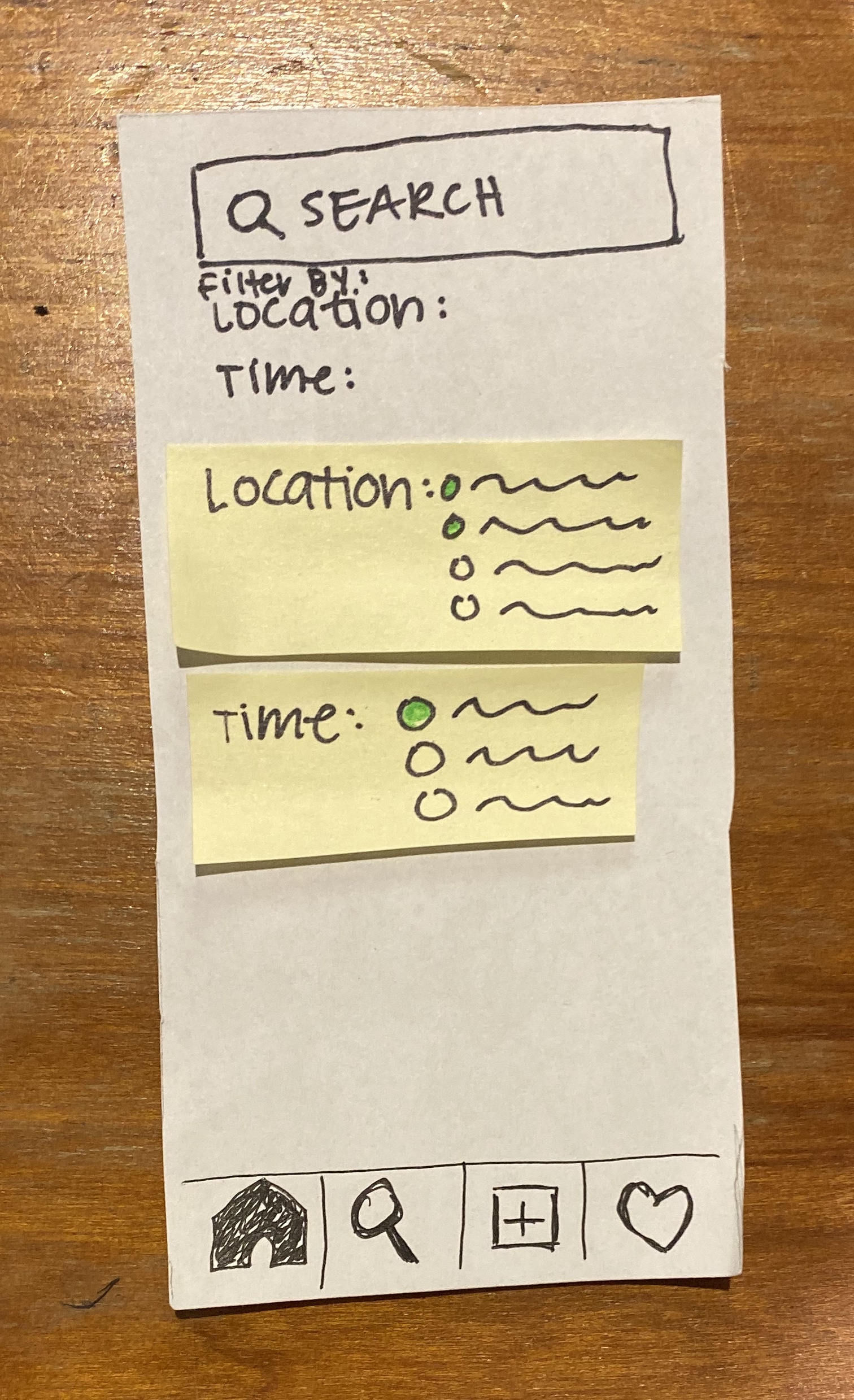
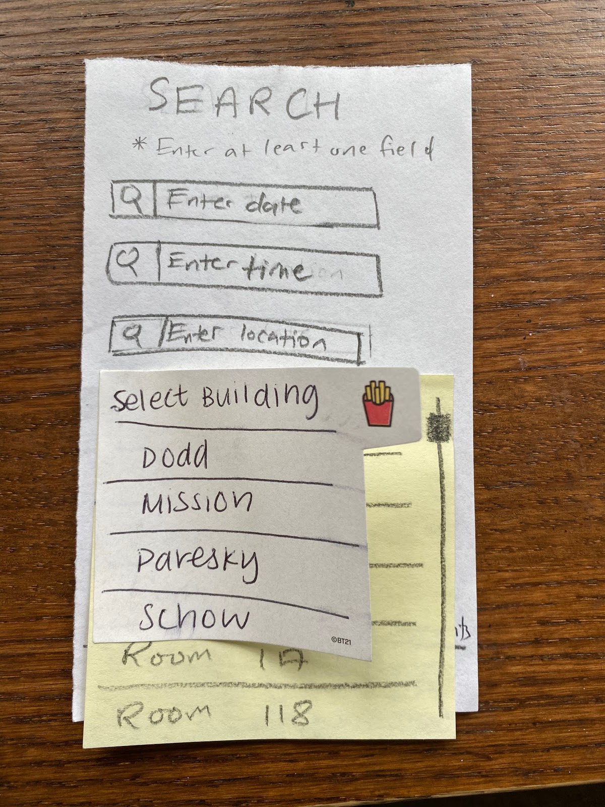
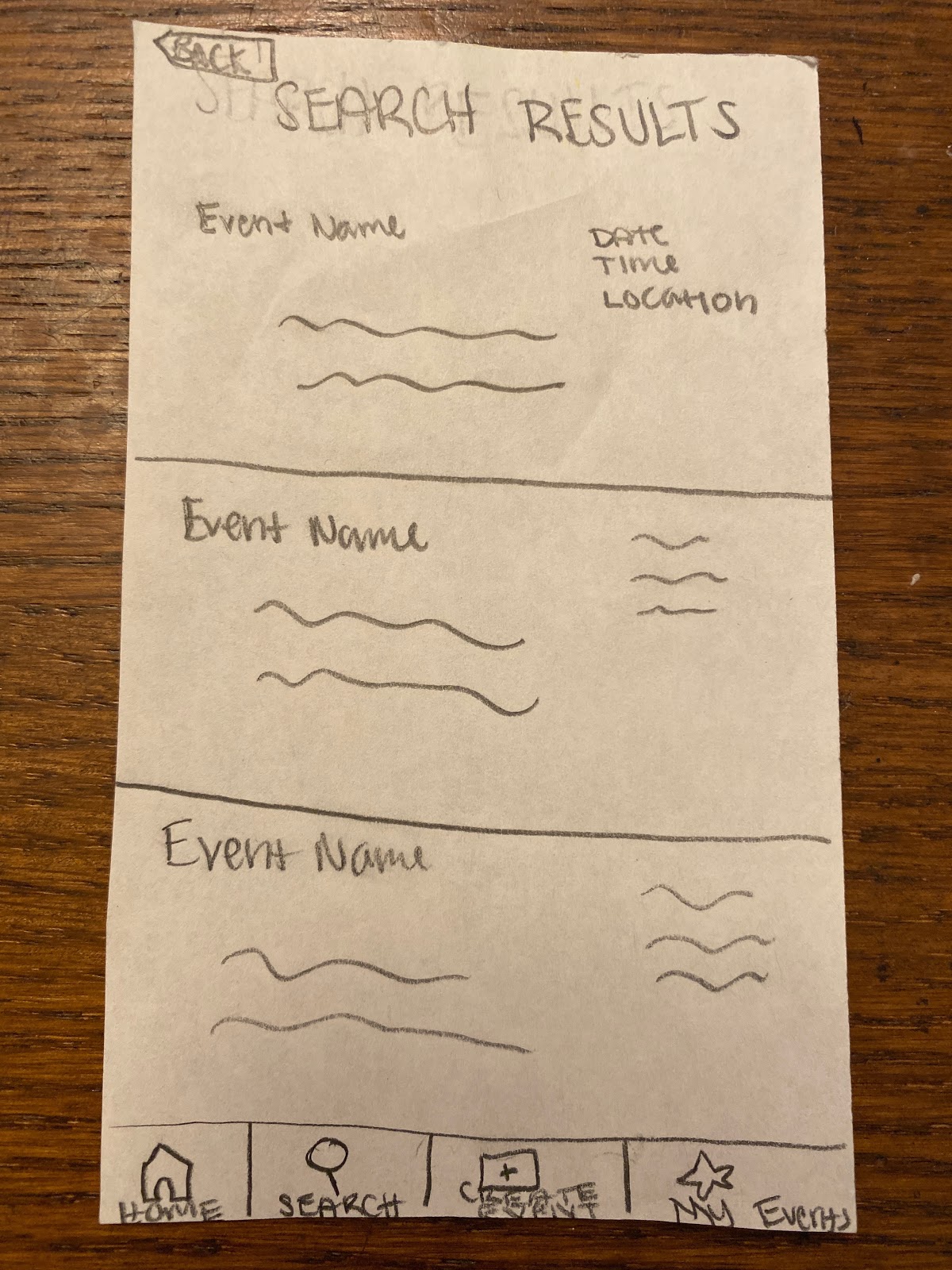
The user can alternatively browse through the “Search” page by entering the location, icon, or event name. There is an option to filter through all the upcoming events by location and time. After clicking on the desired filter category, the user can check all the filters they want to add.
Original Task 2: Creating a Social Space
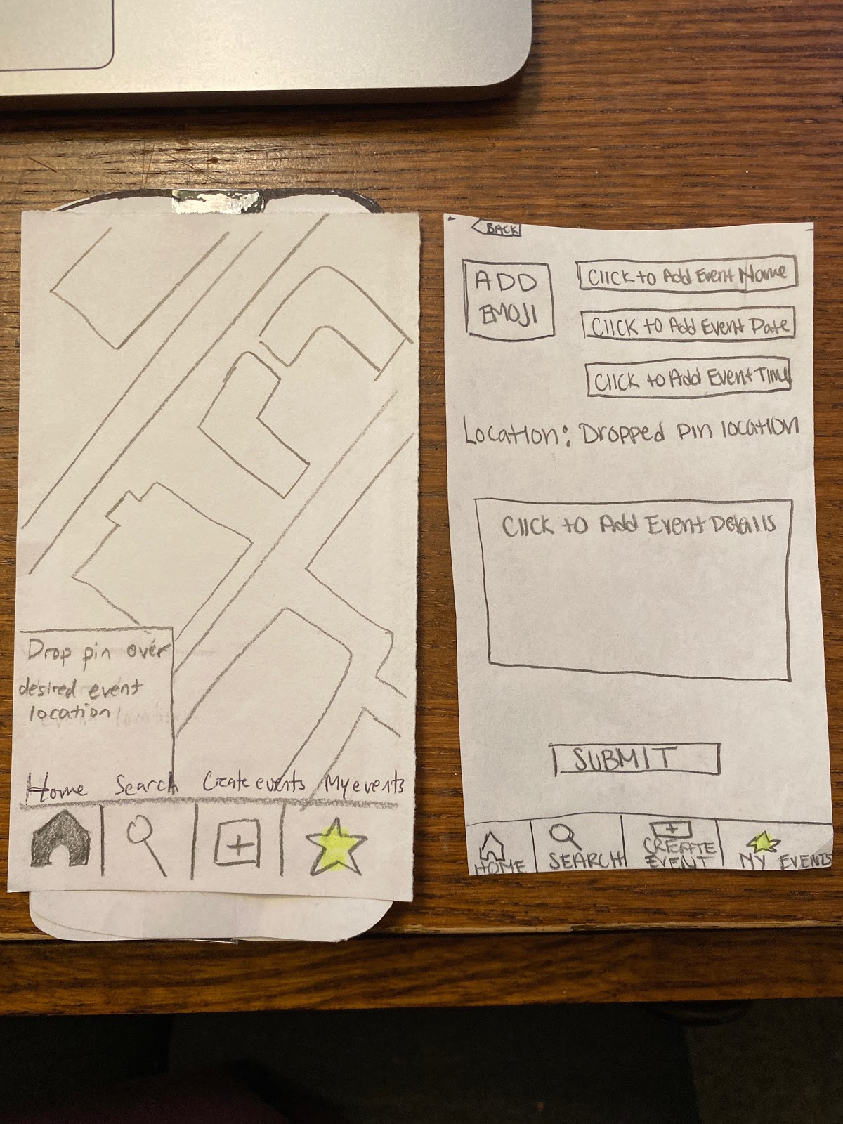
You enter a map once you tap on the +. Here, you have a pointer that you can drag and drop onto the location of the event you are trying to create.
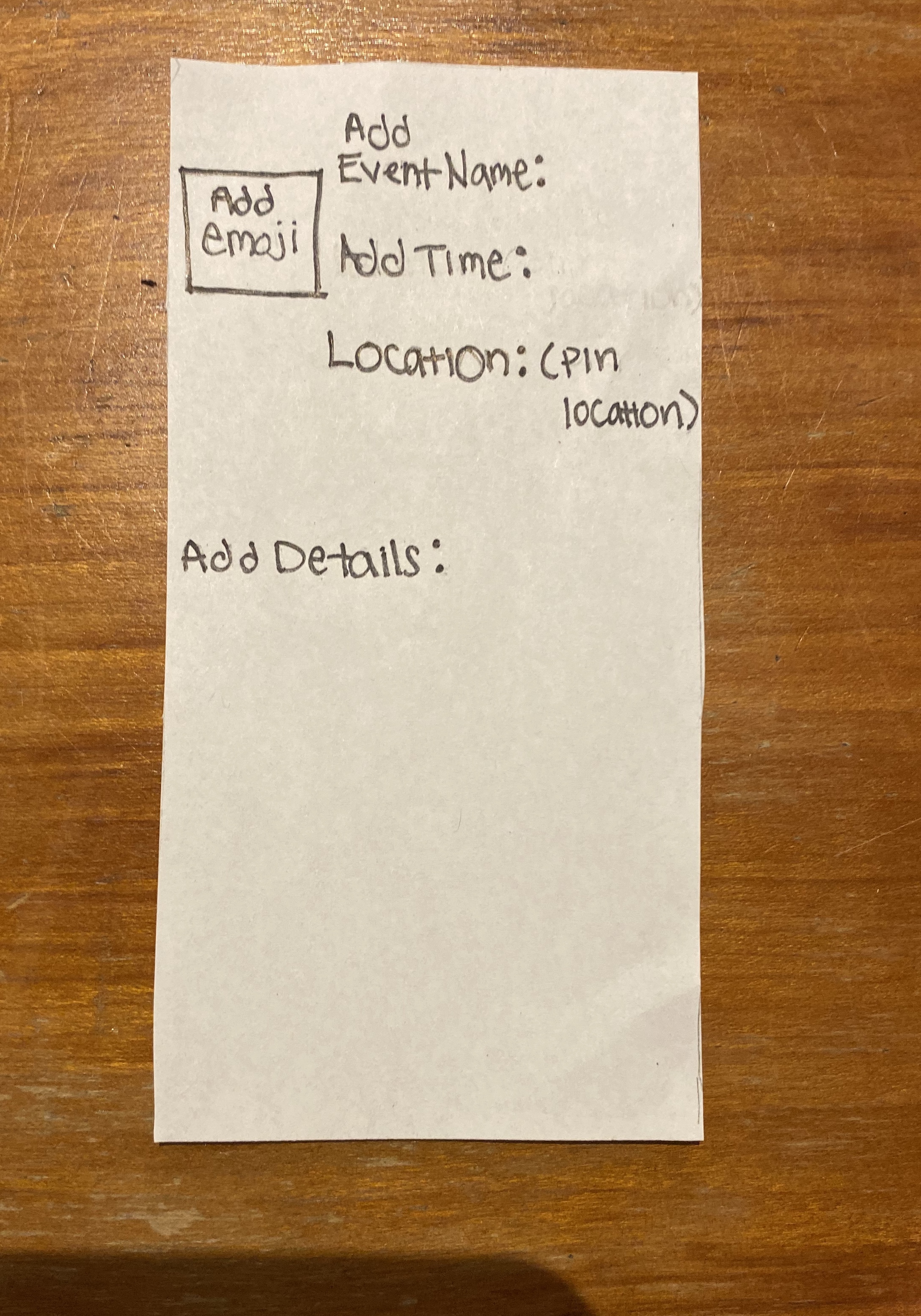
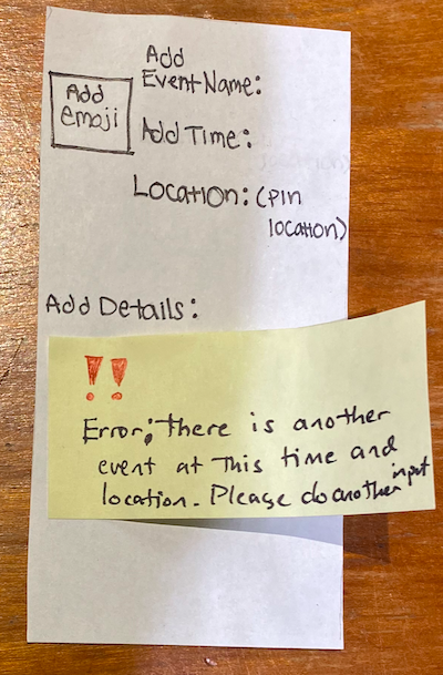
After dropping the pointer icon you are immediately redirected to a blank event template where you can enter the title of the event, time, details, and add an emoji related to the theme of your event. When the user tries to create an event at the same time and location as an existing event, the user will be confronted with an error message instructing them to pick a new location or a new time.
Testing Process
Heuristic evaluation
The first step in the testing process was to conduct a heuristic evaluation. We completed two heuristic evaluations in class. In the first evaluation, Hailey took notes, Nyla was facilitating, and Gavin was evaluating HikAR’s design. In the second evaluation, Gavin took notes and facilitated while Hailey and Nyla went through Harmonee’s design.
Cognitive Walkthrough
Our second step in testing our paper prototype was to conduct a cognitive walkthrough of our design. It asked questions about how intuitive our design was. We realized that a lot of our findings were similar to feedback received from the heuristic evaluations. We personally feel as if the cognitive walkthrough could have been more useful if it was done on an outsider. Below is the worksheet completed in class:
Usability Tests
The final step to our testing was conducting three usability tests. The procedure is as follows:
- One of us introduced the application as an app that helps students create and find events through an interactive map. We also gave some background about the HCI course.
- Then, we explained that the first task was to create an even and encouraged them to think out loud.This person guided the user throughout the testing by changing the paper prototype screens and communicating with the user.
- Another person on our team observed the test and took notes on the user as well as the process to help with future usability tests.
- The second task of finding an existing event was only explained after the first task was completed.
Our first usability test was performed with our paper prototype on a Williams College student who had no prior experience with this type of interface design, so they would be representative of the users that would most likely use RES (U1). We did not want any distractions so the test was performed in a quiet study room in Sawyer Library. One of the main aspects learned about the testing process was that the user will continuously look at the testers for unspoken approval or disapproval when going through the process of completing a task. It is therefore really important to maintain a neutral demeanor throughout the process of facilitating a usability test so that you are not unintentionally telling the user how you would like them to behave. This is something that we will be more conscious of next time.
Our second test was performed female undergraduate student who lives on Williams campus and actively attends academic school events (U2). We chose U2 as a participant because she is representative of the demographic that we want to enhance this task for. We conducted this usability test inside her dorm room as if she was actually using the app in the comfort of her room. Her dorm room is isolated from central campus and does not have many events happening. Hailey facilitated the test while Gavin took notes.
Our third test was conducted on a male underclassman of color (U3). He is part of an identity-based affinity group on campus and frequently plans and hosts events for the group. After our second usability test which focuses on a person who attends a lot of events, we wanted to get additional feedback on a person who hosts a lot of events. The usability test was conducted in the participant’s common room which is a convenient location for him. It is also a gathering space for him and his friends from the group. They frequently meet there to do school work, watch movies, and have meetings for their club. Gavin facilitated the usability test and Hailey took notes.
Testing Results
Heuristic Evaluations:
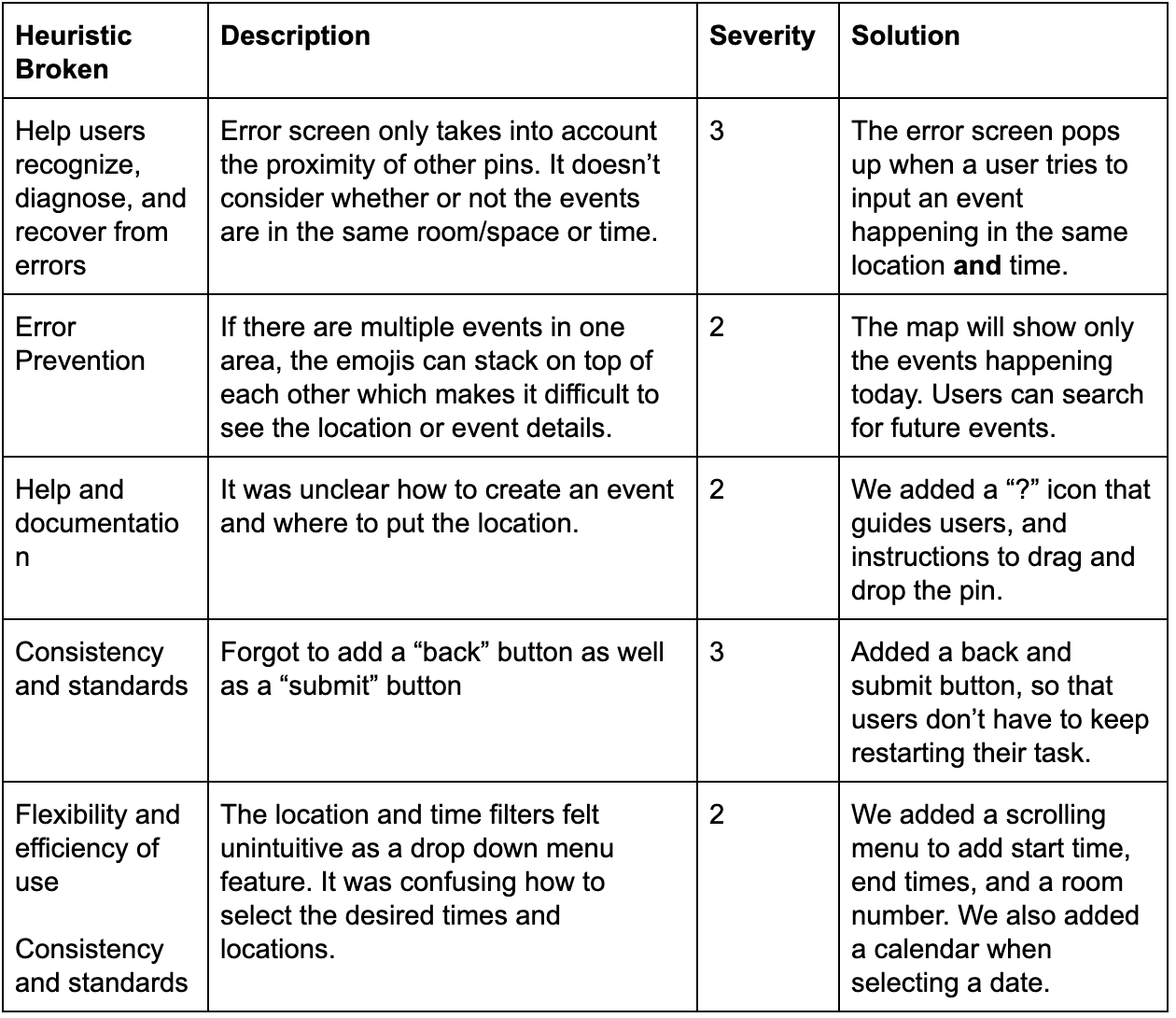
We received feedback on our design, specifically about confusing fields, unlabeled icons, and usability of the map interface. A critical issue we faced after these evaluations was that the housing administration point of view was very difficult to demonstrate. We thought that the administration point of view could be deemed as a separate task, so we removed it from the testing (it is still a feature of the design). After having outsiders’ perspectives, we realized that this confusion could be an obstacle from the user having the best experience. An overview of our findings are provided below:
Cognitive Walkthrough
After our heuristic evaluations, we realized that our tasks were very broad and hindered us from focusing on details. We narrowed our tasks to creating an event and searching for an event. Browsing and responding to an event is very similar to searching, and thus felt redundant. The findings from our cognitive walkthrough did not point us in any direction as it was us, the designers, walking through our design. After refining certain features from the heuristic evaluations, the transitions from each page were smoother.
Usability Tests
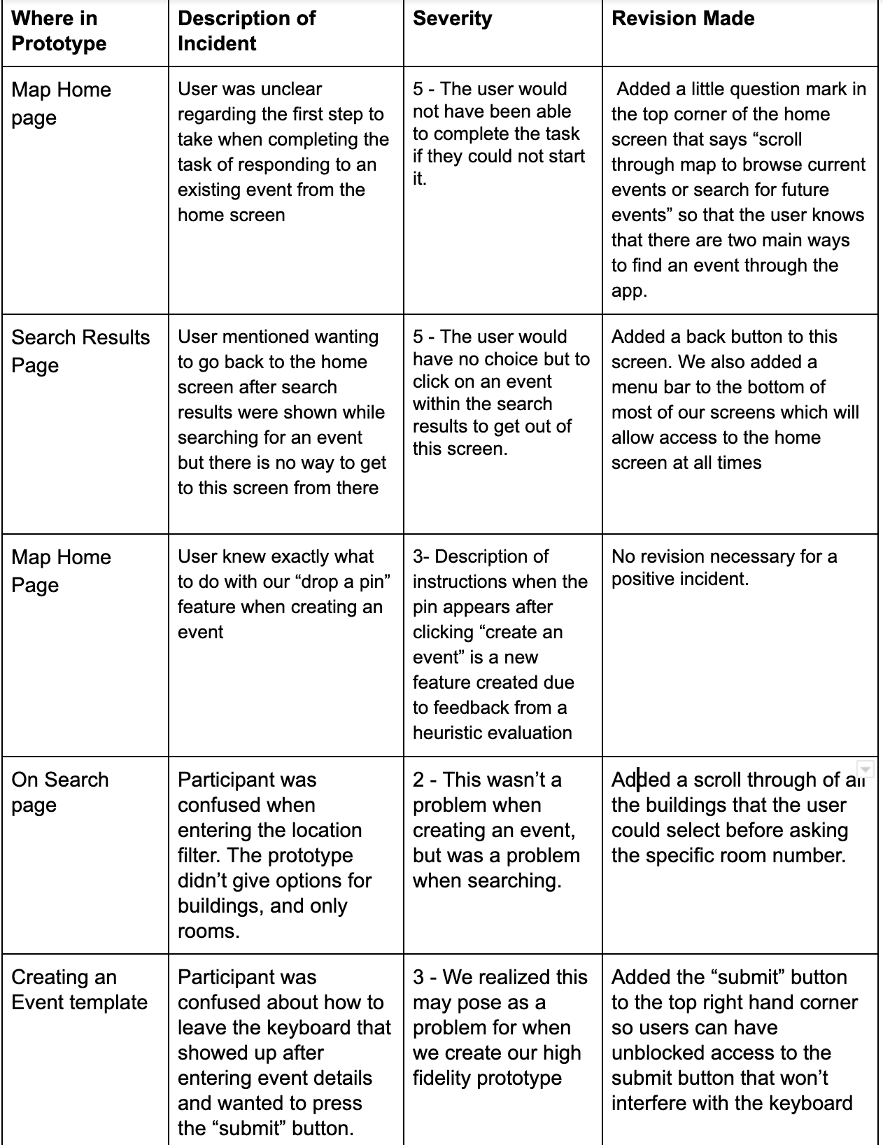
Through our three usability tests, we were able to simplify our design and make each step more intuitive. U1 stated that it was unclear how to first create an event and that having no back button was inconvenient. We altered our design to include simple directions and have the back button and taskbar at the bottom for every page. After this revision, U2 and U3 went very smoothly. Some minute changes we implemented were to refine the search filters and the scroll bar menu to better fit our design. We also realized that incidents do not necessarily have to be negative as some features worked really well for our users. Because there were redundant incidents from U2 and U3, we condensed our findings into an organized chart below:
Final Paper Prototype
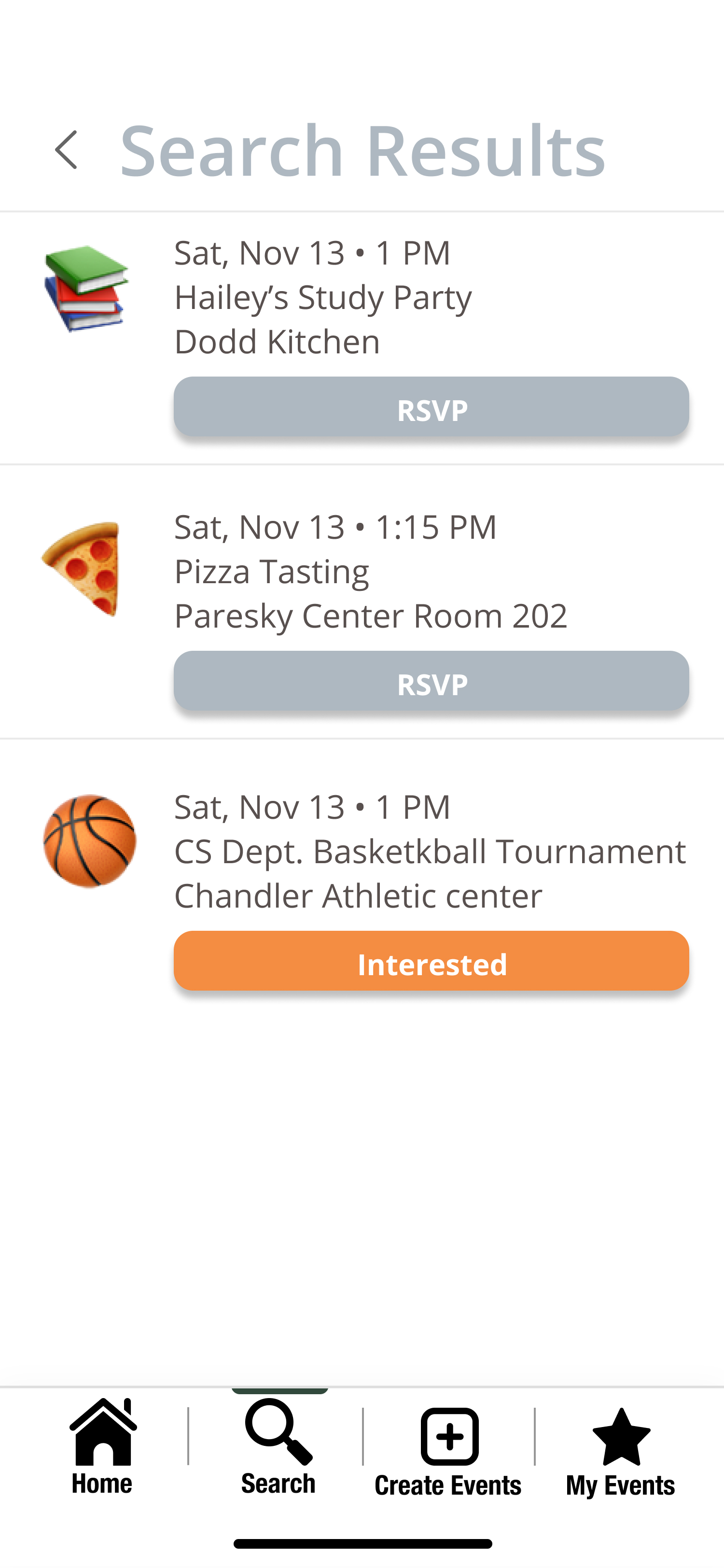
Our final paper prototype features two tasks – searching for events and creating an event. The searching for events task includes entering a date, time, and location.
New Task: Search an Event
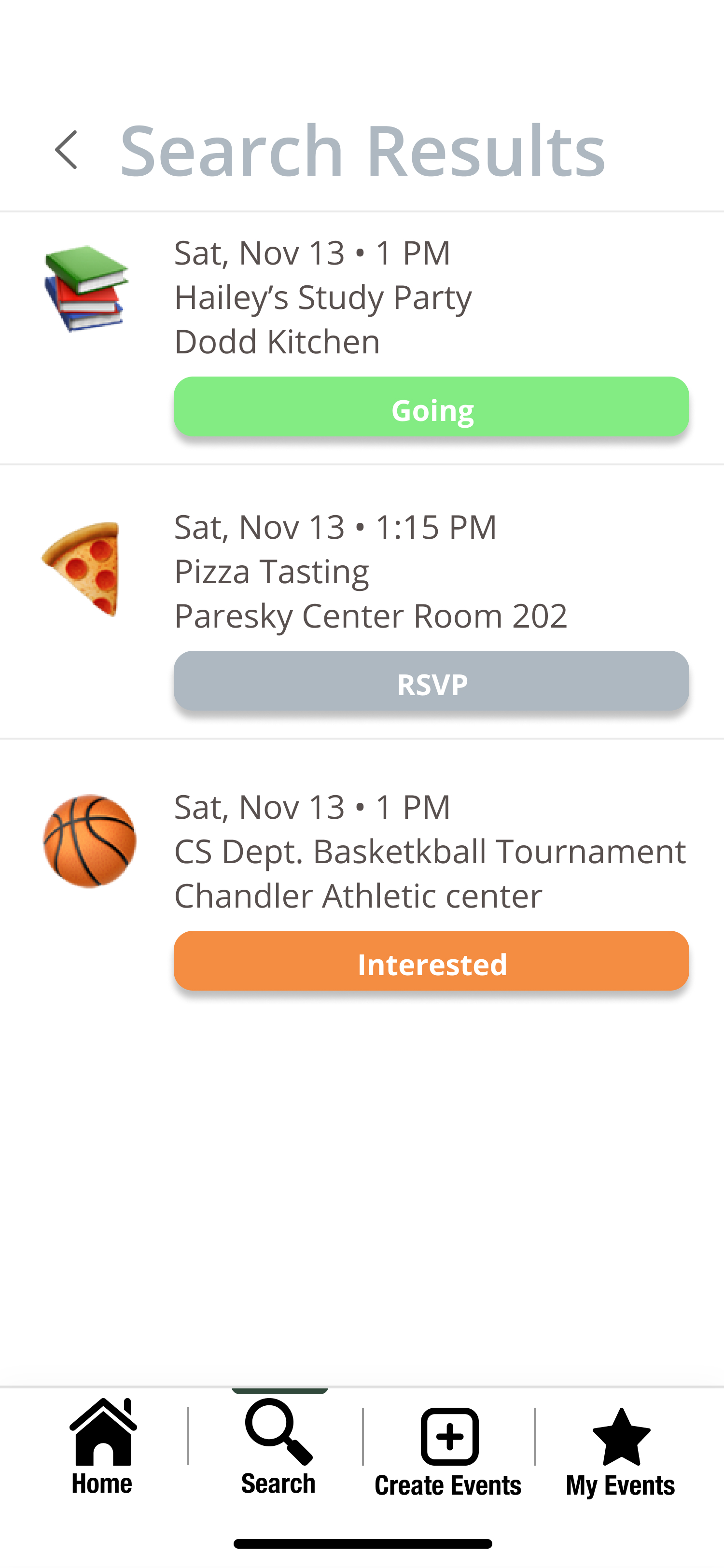
The search result then comes up and users can decide whether to declare their attendance, interest, or non-attendance to events.
Create an Event
The creating an event task includes dragging and dropping a pin on the desired event location on a map which transitions to a screen where the user needs to input an emoji, the event’s name, date, time, and description.
Digital Mockup
Our digital mockup features two tasks – searching for events and creating an event. The searching for events task has three filter categories: event date, event time, and event location. The time input is just one time and all events that cross through that time will be shown in the search. Meanwhile, the event location is a general building/space so that all events within that building, regardless of room, will be shown. The search results will show all events that the filters apply to and users can then decide whether they are going, interested, or not going to the events shown. The changes we made for this task are the indicator in the bottom screen bar to show that users are searching for an event, the repositioning of the confirm and cancel buttons on the add time feature, the RSVP button in the event searches as a placeholder for events the user hasn’t responded to, an event description popup that provides a description of the event, and back buttons.
Our other task, creating an event, starts with the map so users can drag and drop a pin to where they want their location to be. Dropping the pin then transitions the user to the create event page, where the user inputs an emoji, the event’s name, date, start and end time, location, and description. Changes we made include the indicator in the bottom screen bar to show that users are creating an event, the repositioning of the drag and drop icon text, a start and end time for the event (we previously only had one time to input). Users that try to create an event without inputting the necessary information (red-starred) will receive an error popup.
Task 1: Creating an event.
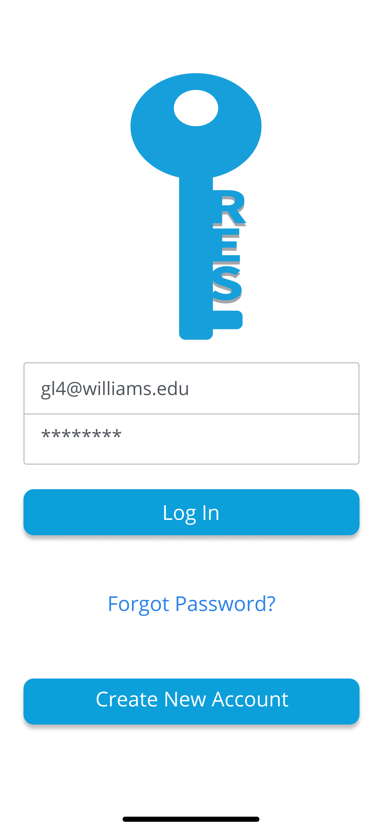
First the user logs into the app as a student using their school email address and password.
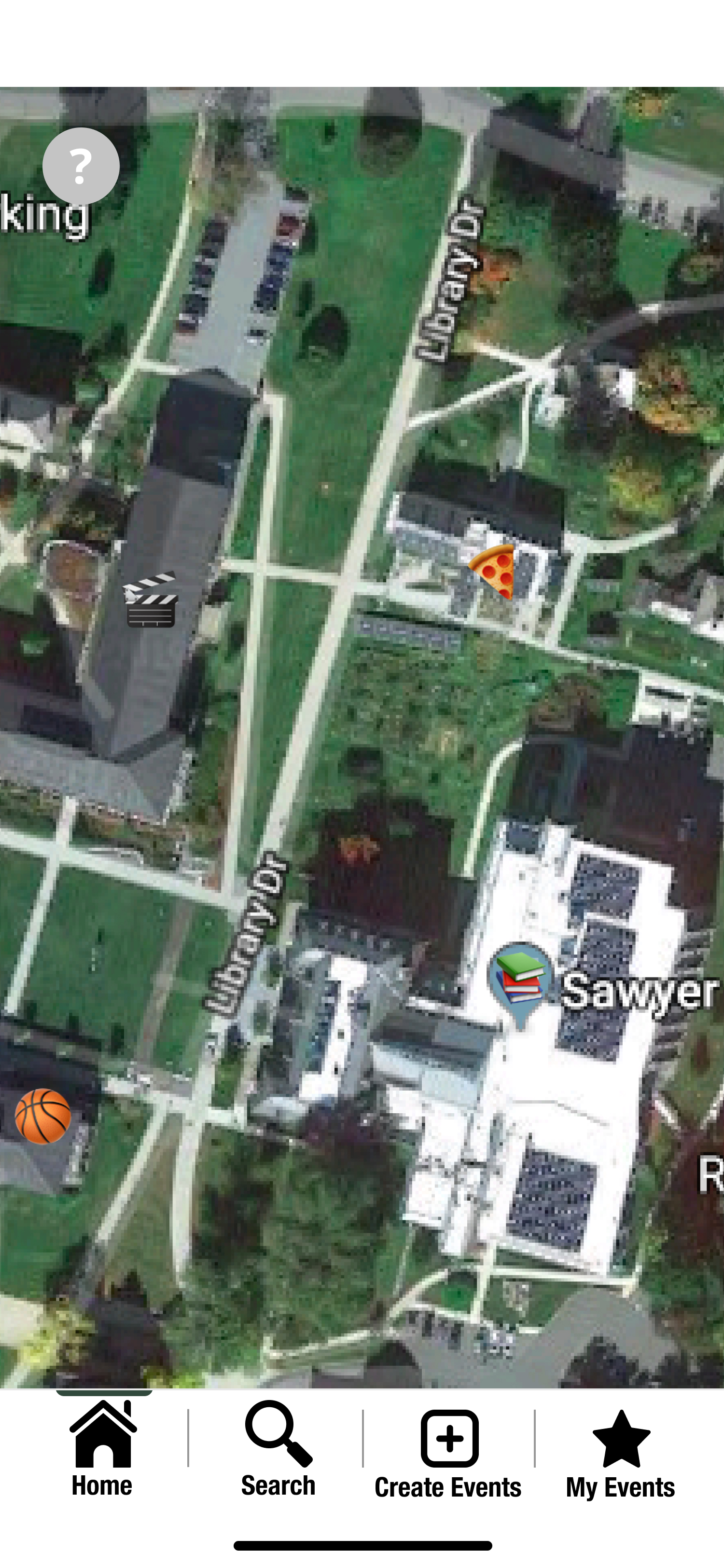
The user is then immediately taken to the homescreen of the interactive emoji map, and can click on “Create Event” on the menu bar near the bottom of the screen
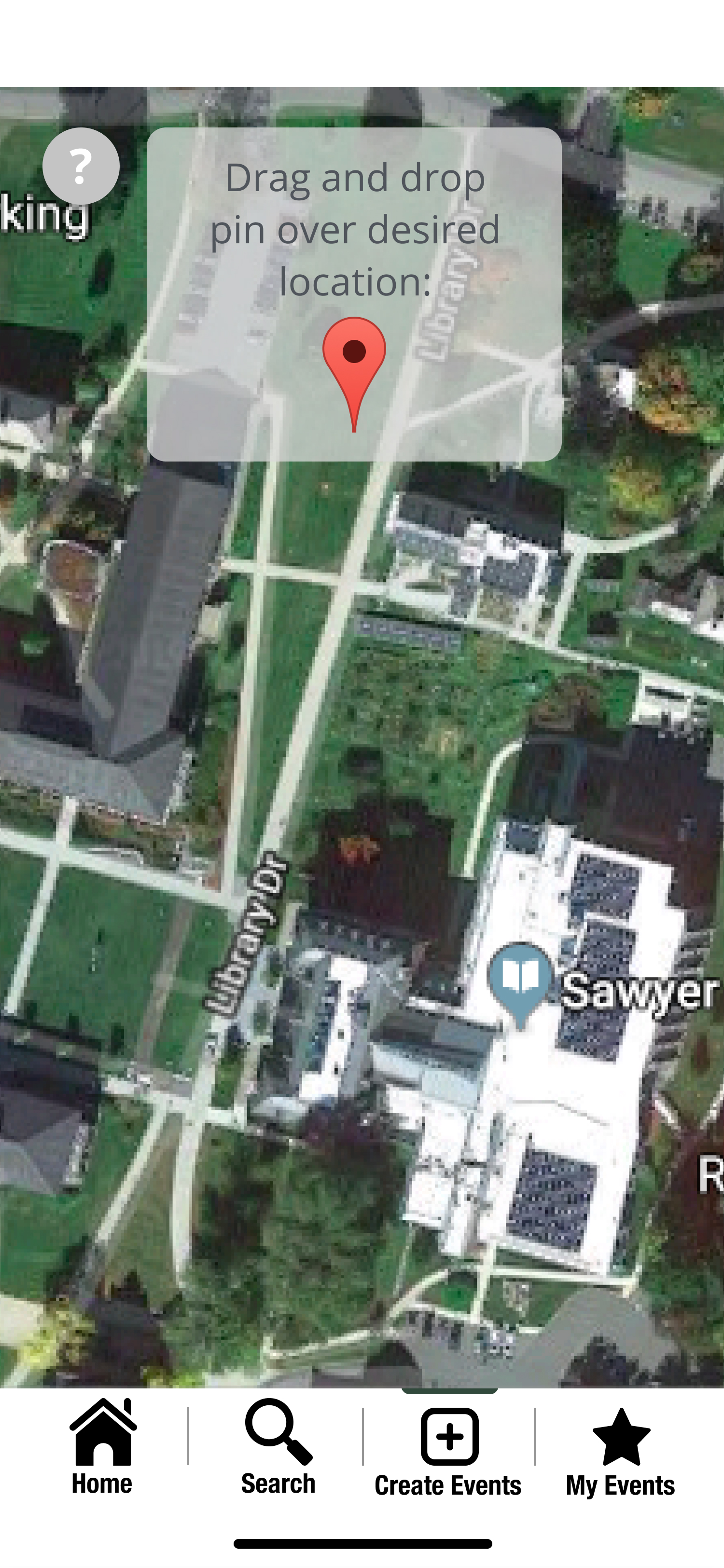
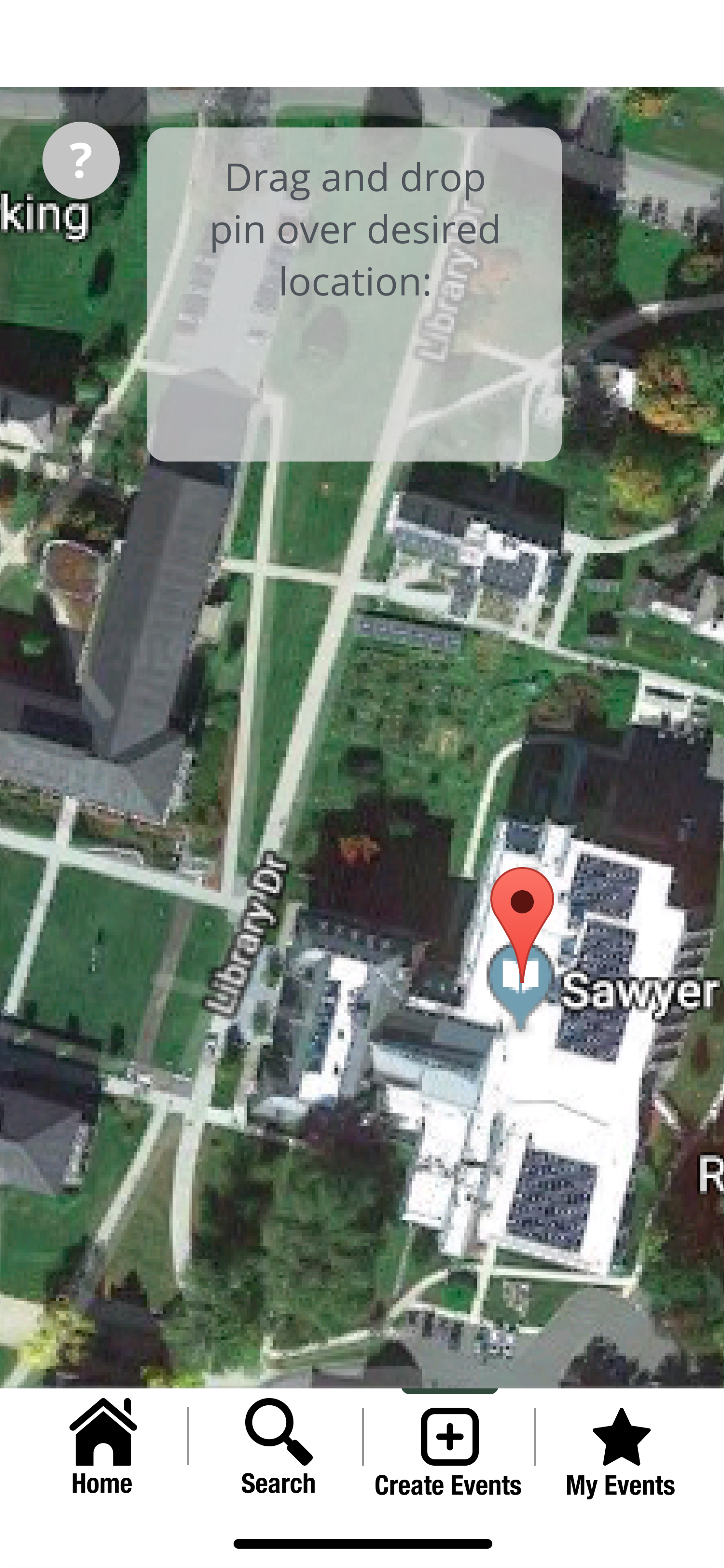
The user is then prompted to drag and drop a pin on the map to indicate the desired location of the event that they will be creating.
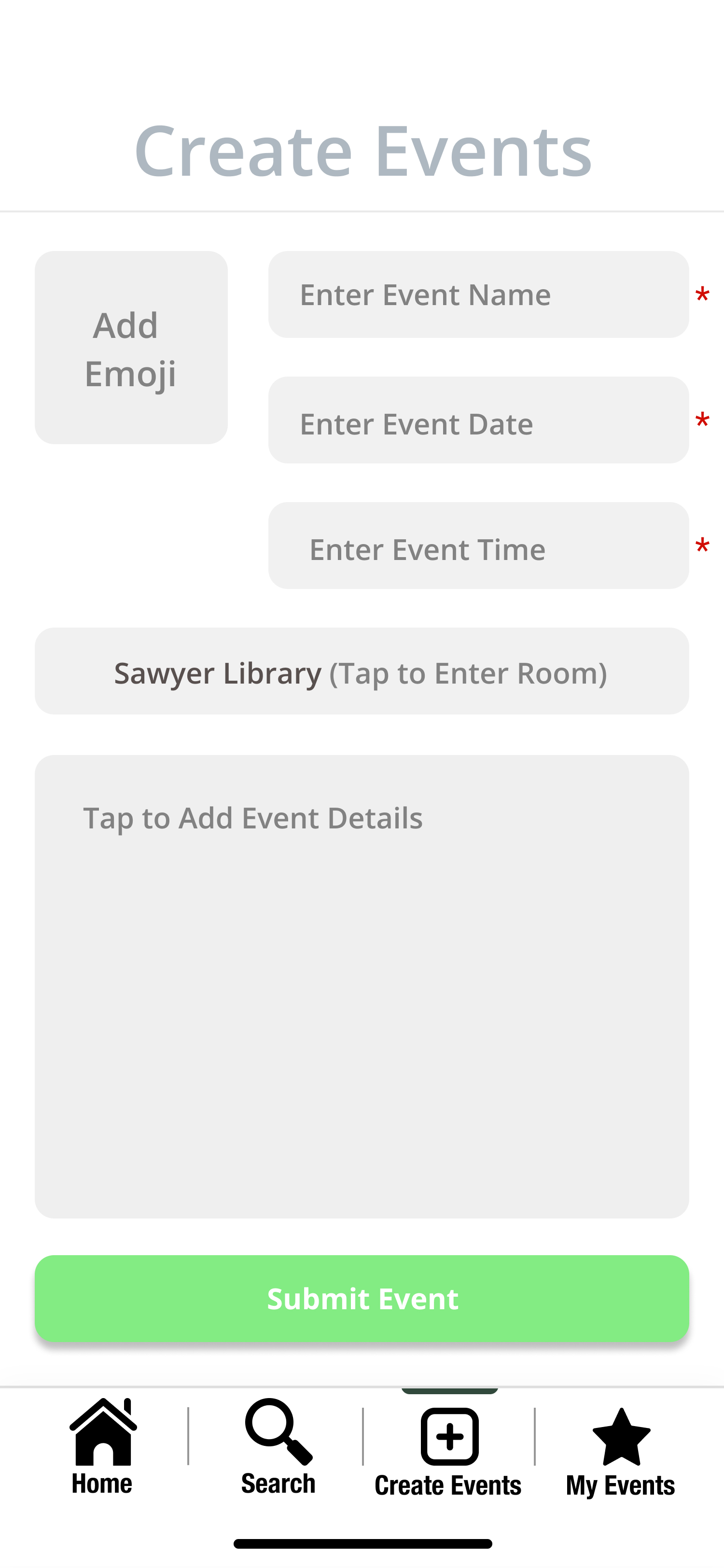
Once the user drops a pin, a screen in which they can input and submit information regarding the event pops up.
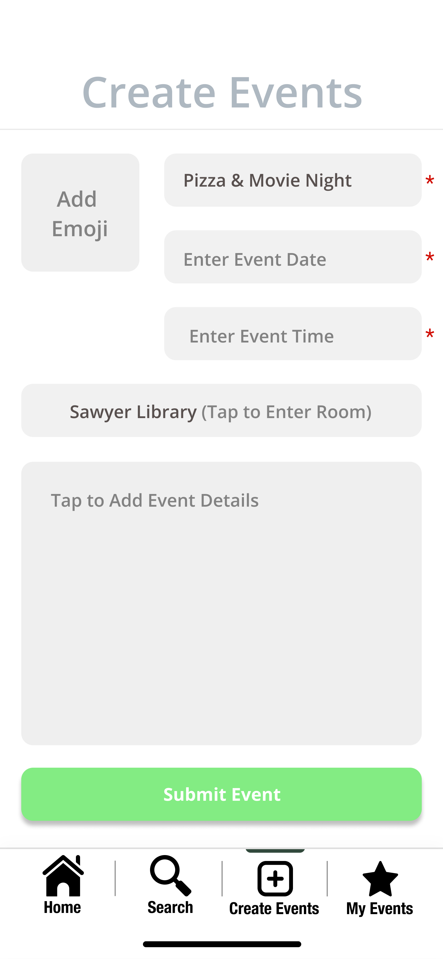
The user can type in the event name.
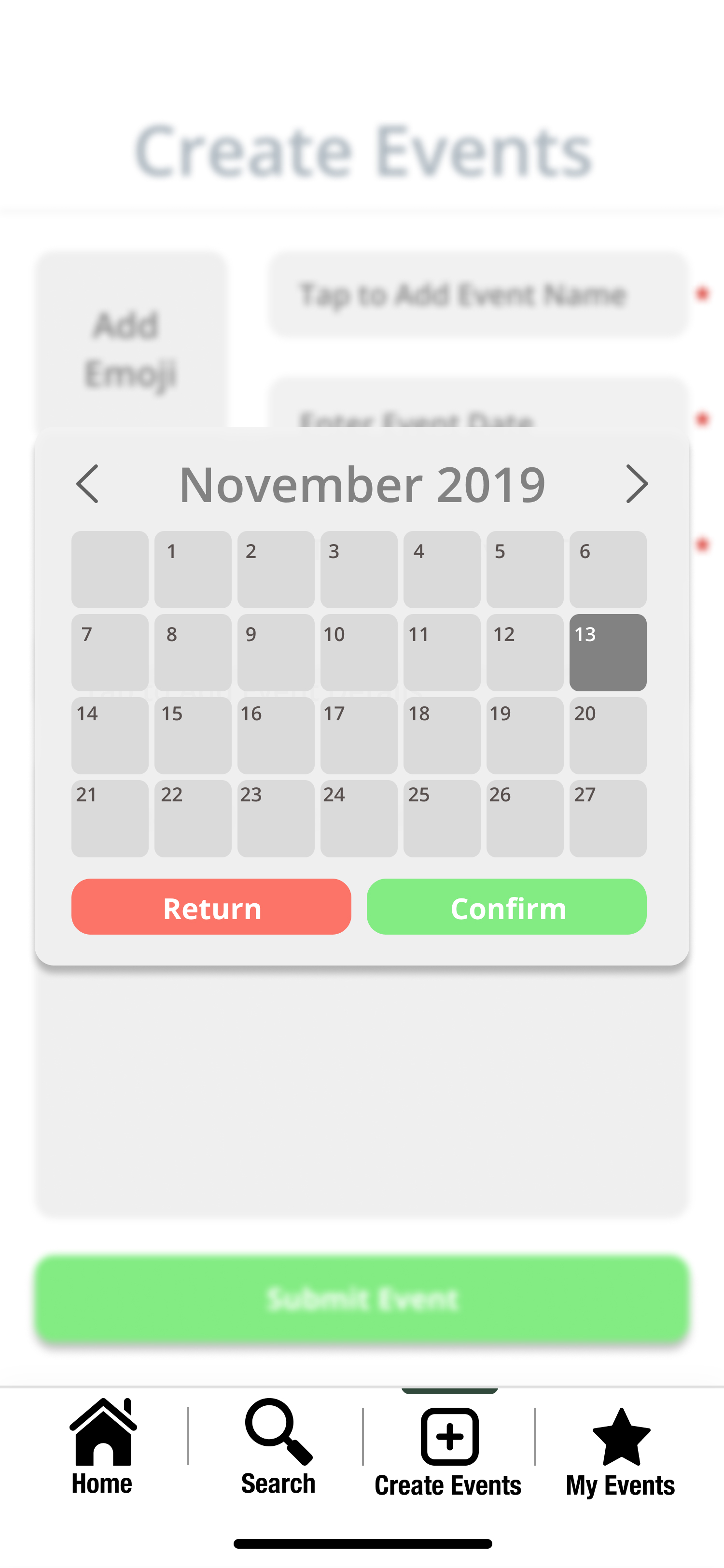
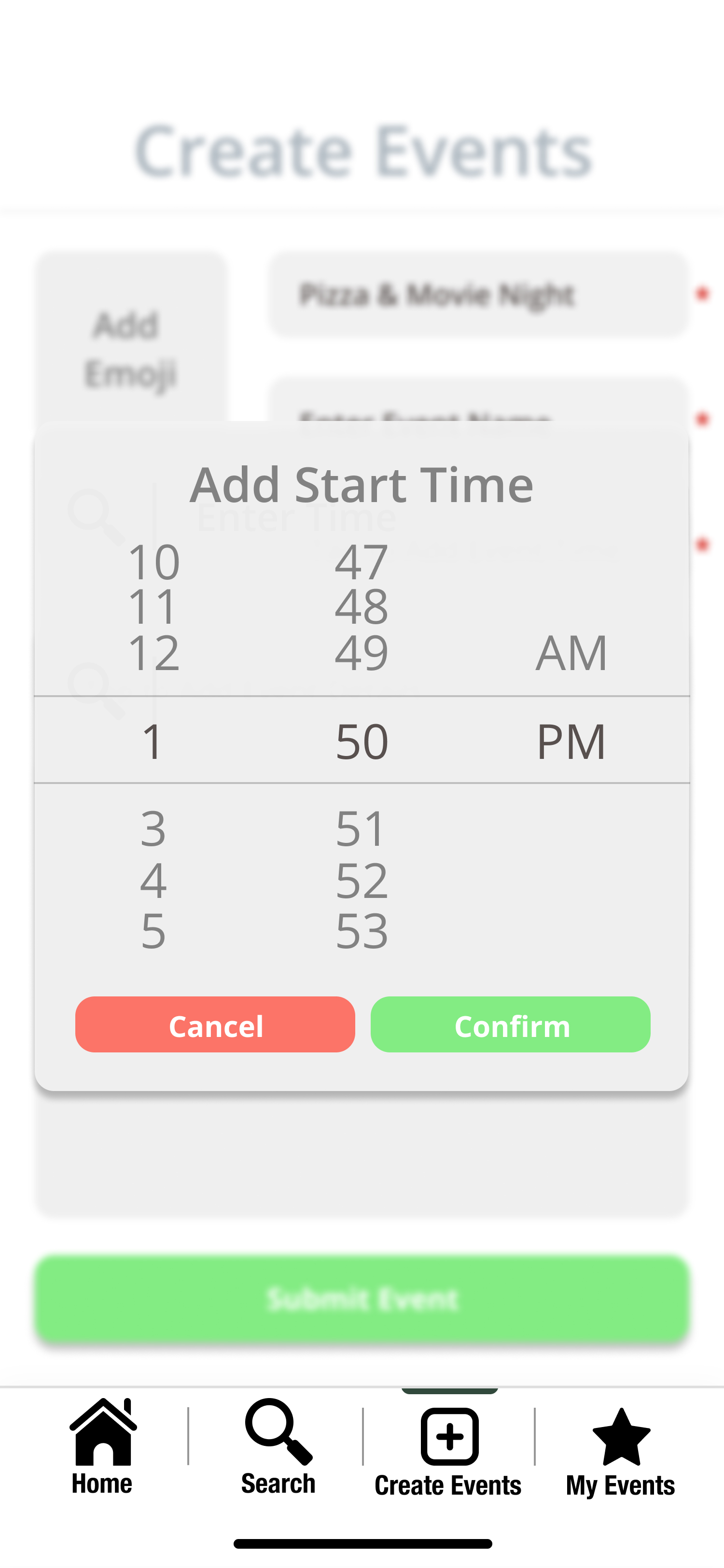
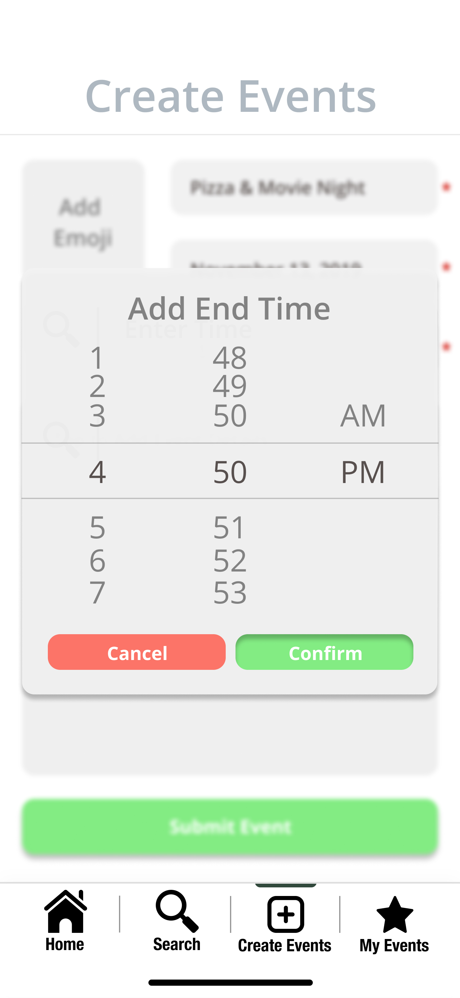
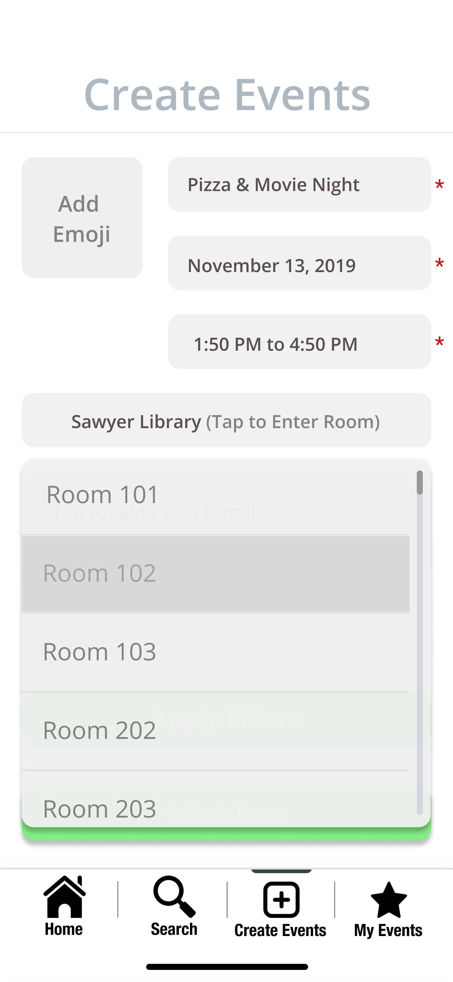
The user can use the calendar to input the desired date of the event, insert the time by scrolling through the pop up screen, and can then specify more specifically the location of the event, such as a specific room, based on the pin that they dropped earlier specifying the building.
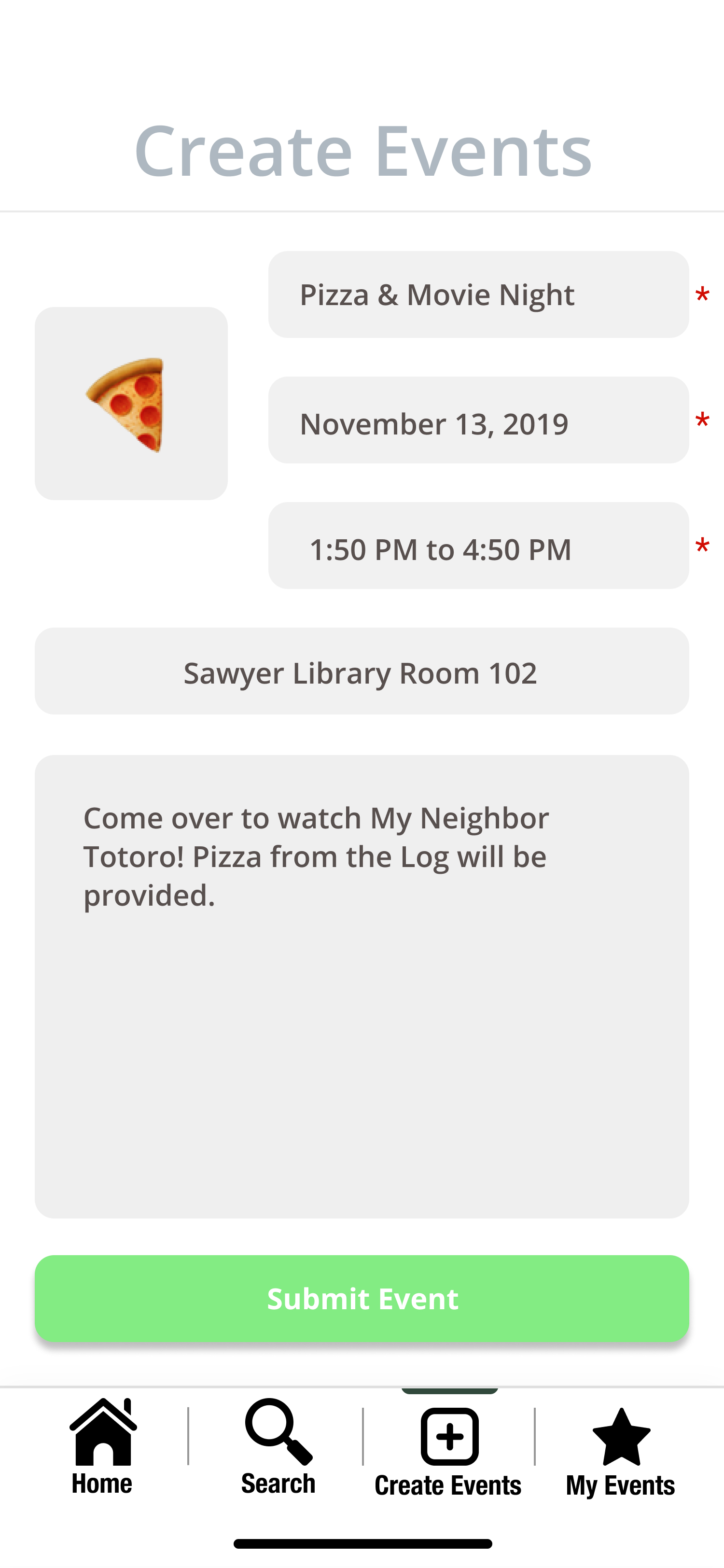
And lastly, the user can choose an emoji to represent their event on the RES map before proceeding to submit the event that they are creating by clicking on the “Submit event” button.
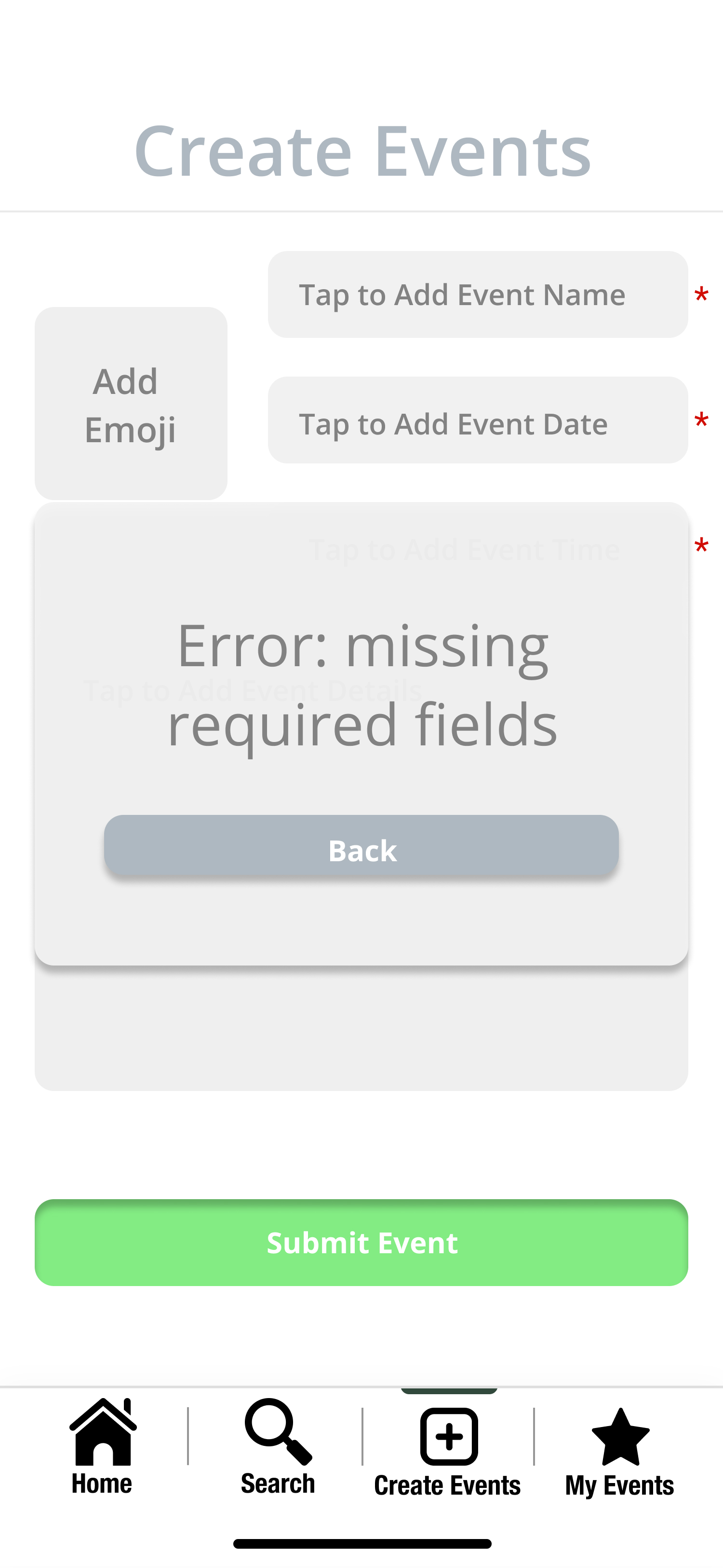
If the user does not input a required field, they will be sent an error message.
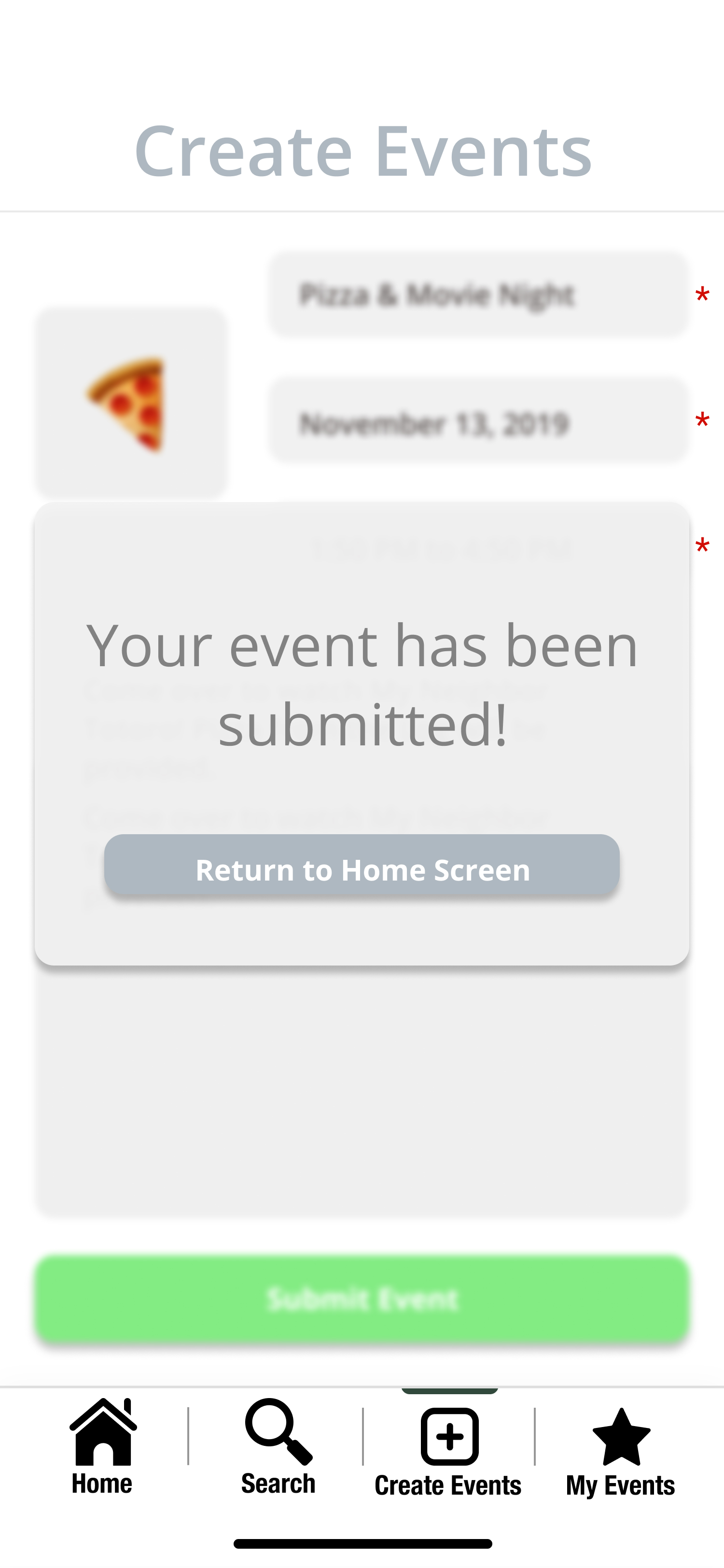
After the user submits information for the event that they have created, they will see a pop up indicating that the event has been successfully made and be prompted to return to the home screen.
Task 2: Search an Event
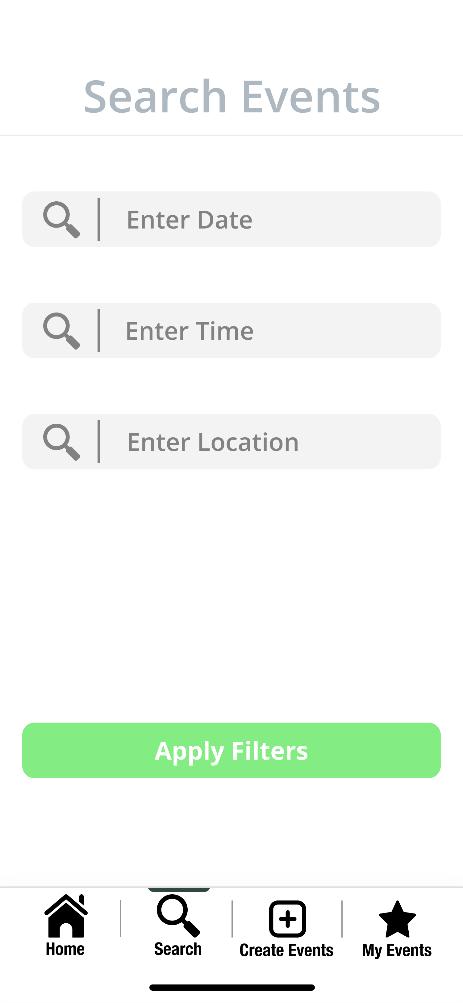
First, the user goes to the “Search Events” page in the bottom task bar. They are prompted to enter a date, time, and location. The user is able to enter details as specific as they want.
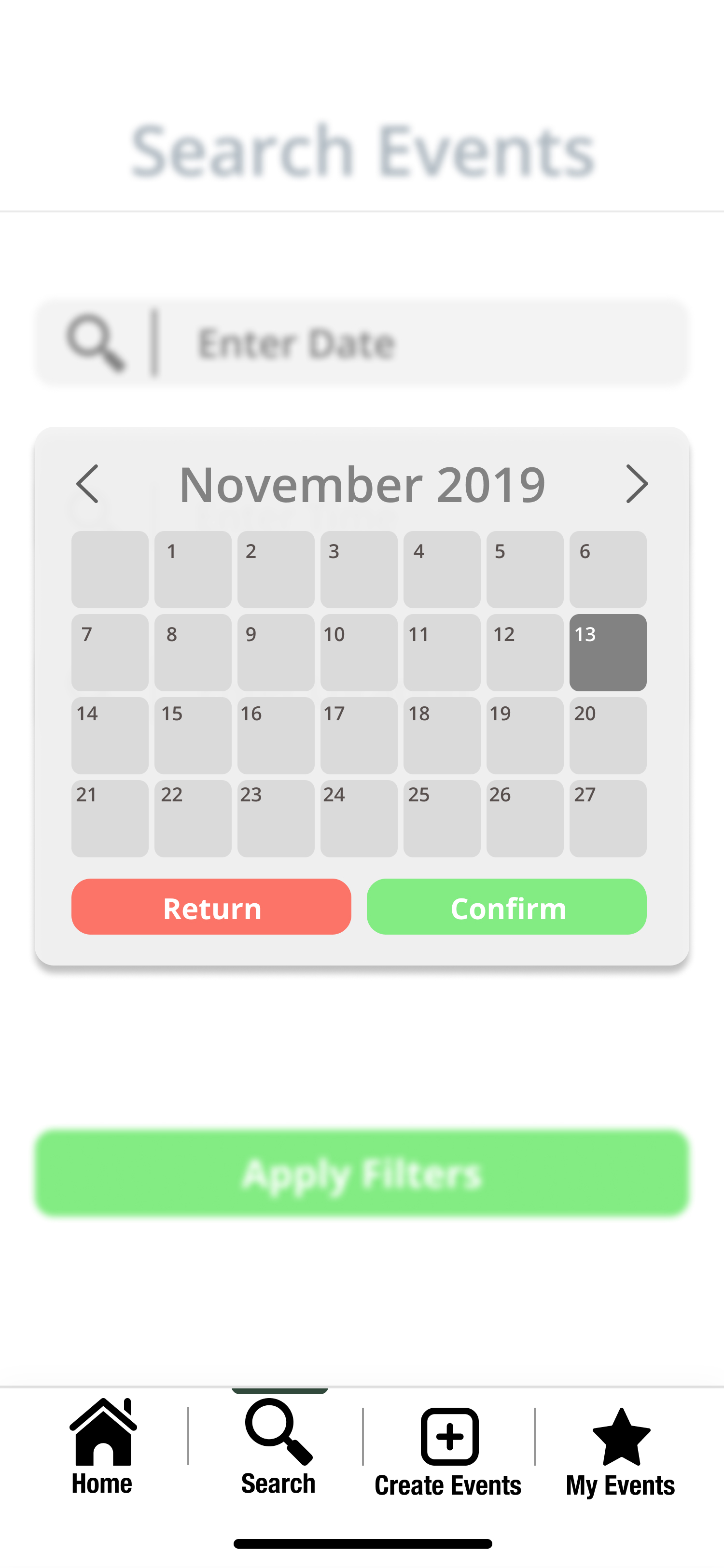
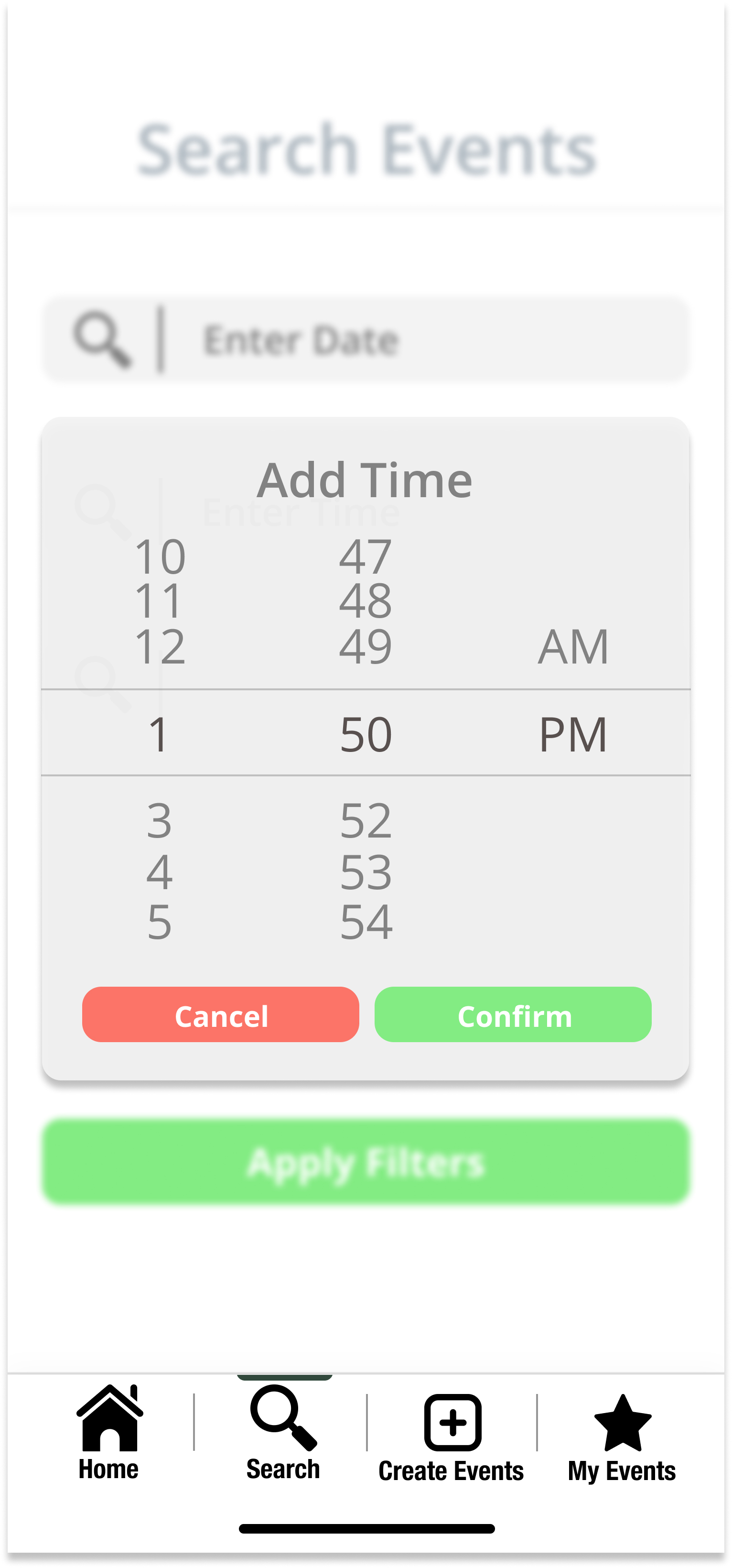
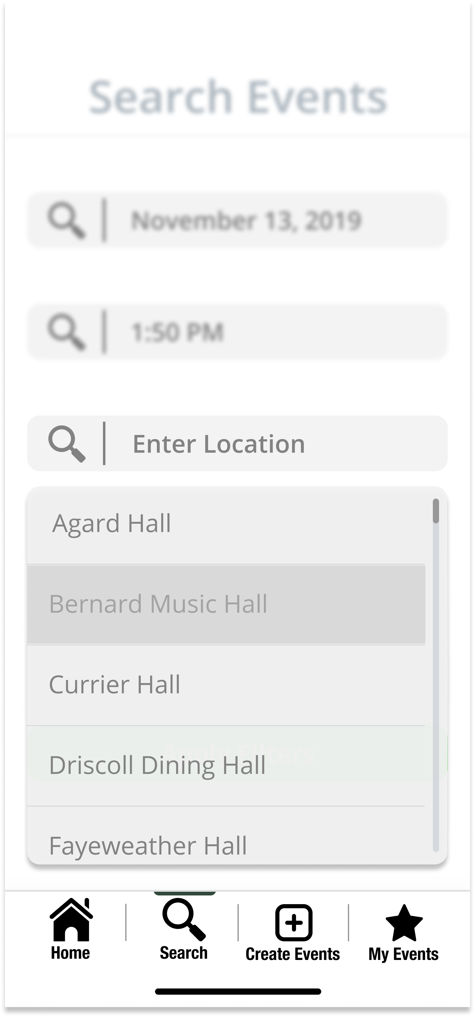
The user can select a date on the calendar, select a start time by scrolling through the list of times, and select a building location of preference.
After the user fills out the details, a list of events that fit the criteria will load onto the page. They can scroll through this comprehensive list to see their choices.
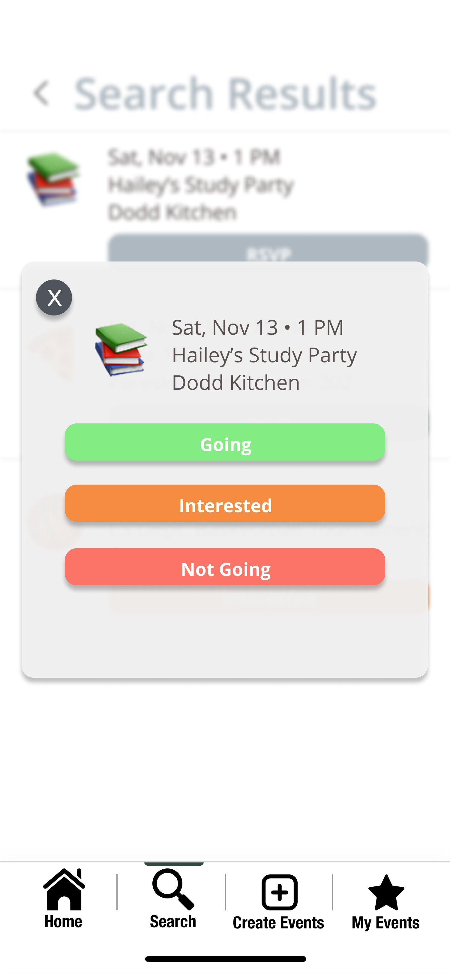
After finding an interesting event, the user is able to click on the event to find out more details.
They can respond to the event by selecting “Going”, “Interested”, or “Not going”.
After the user has indicated the response of choice, they are referred back to the comprehensive list.
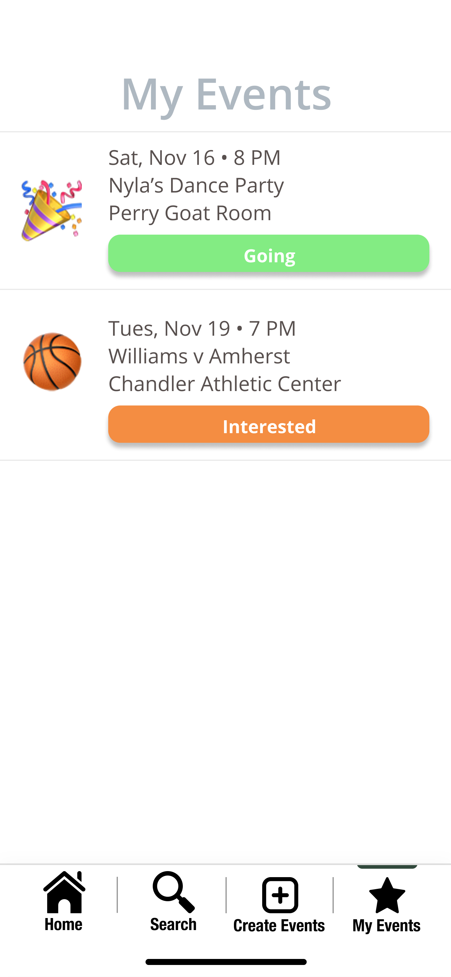
The user is then able to view the events they have responded as “Going” or “Interested” in the “My Events” page.
Discussion
RES transformed drastically through the process of iterative design. Not only were we able to decide between multiple big ideas brainstormed for the application, but we were also able to add aspects to our design that we had never considered beforehand. Heuristic evaluations helped us discover what was lacking from the perspective of others in our course who were knowledgeable about usability heuristics. This feedback helped us think about emoji crowding, consistency with the way we want users to input information, and identification of the types of users using the app. Usability testing helped us make revisions that were more focused on functionality and user understanding of our design. Revisions therefore included constant menu bar access, labels, and instructions. As our design became more refined, so did our tasks. Our task of creating an event did not change much through revision, however, the way our task of having a user find an event was accomplished changed multiple times throughout the design process. We thought that users would have some sort of profile or that they would only be able to attend events hosted in their residential communities at first. Our final design involves a school email login as identification of our users, and while users will get event flare notifications for events within their housing community, they will also have access to other events on their campus. We also considered having our task of finding events look different based on whether or not you are a student or faculty member, but then realized that those are two separate scenarios within a task which would be out of the scope of this course, and therefore decided to only focus on students. Overall, the iterative design process was extremely useful when creating an application focusing on user centered design, and we had just the right amount of iterative revision.
Appendix
Bibliography
- Magnifying glass icon taken from Noun Project by Adrien Coquet
- Star icon taken from Noun Project by Vectors Point
- Home icon taken from Noun Project by Hrbon
- Create icon taken from Noun project by Adrien Coquet
- Pin icon taken from Noun Project by James Kopina, MX
- Information icon taken from Noun Project by Viktor Ostrovsky, RU
- Back icon taken from Noun Project by Florent B, BE
- iOS starker kit sketch Maks Torch
- Map image of Williams College taken from Google Maps