Usability Tests
Over the past week, we conducted three usability tests with users from different demographics. After the first testing, we made revisions according to the users’ feedback and experience. We conducted more two tests with these revisions and noted major incidents below.
Usability Test 1:
Our first usability test was performed with our paper prototype on a Williams College student. We chose this student because they had no prior experience with usability testing or interface design, so they would be representative of the users that would most likely use RES. We did not want any distractions so the test was performed in a quiet study room in Sawyer Library. One of us introduced the application as an app that helps students create and find events through an interactive map. This same person then explained that the first task was to create an event. This person is the one who guided the user throughout the testing by changing the paper prototype screens and communicating with the user (role: computer and facilitator). Another person on our team observed the test and took notes on the user as well as the process to help with future usability tests (role: notetaker). The second task of finding an existing event was only explained after the first task was completed.
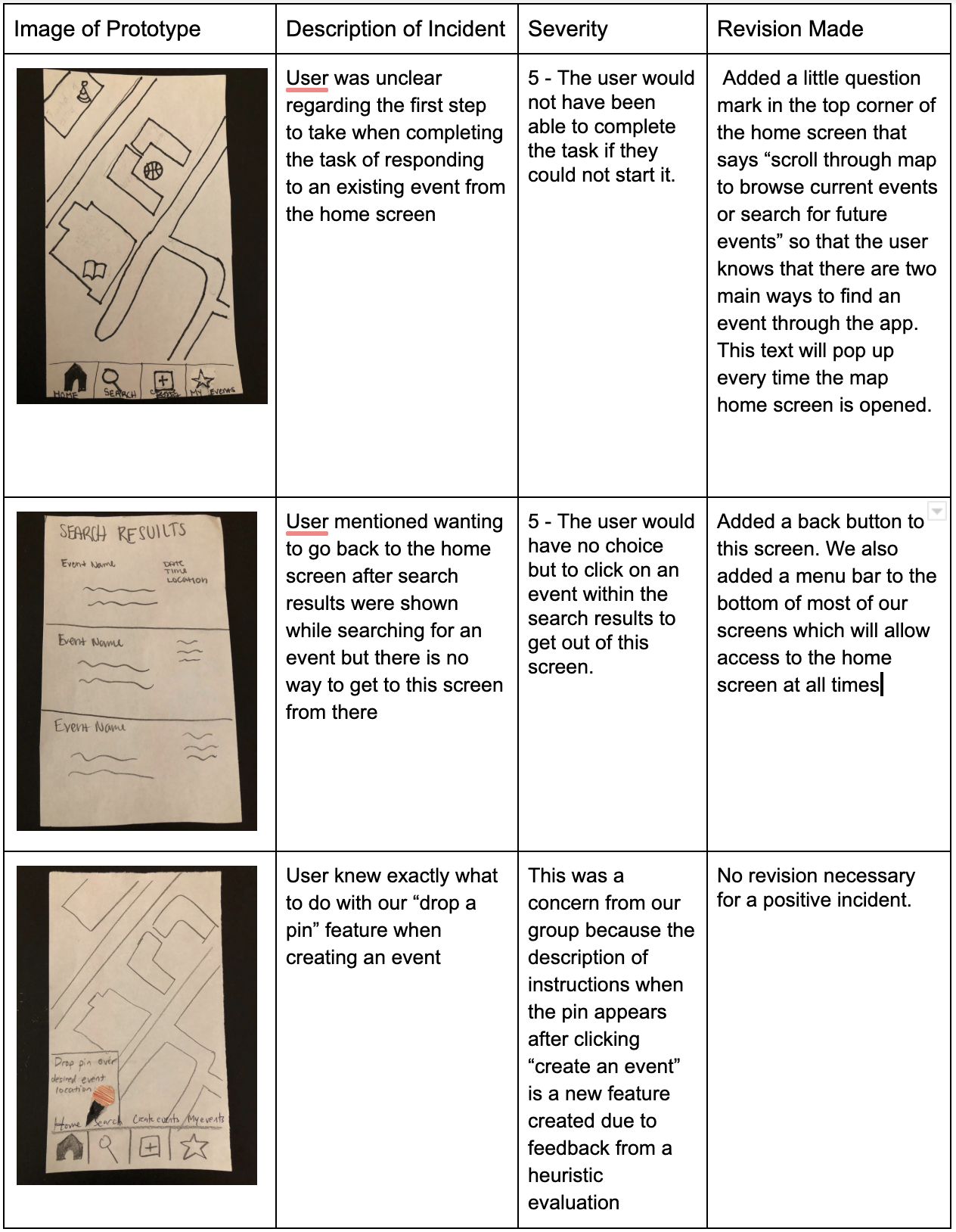
One of the main aspects learned about the testing process was that the user will continuously look at the testers for unspoken approval or disapproval when going through the process of completing a task. It is therefore really important to maintain a neutral demeanor throughout the process of facilitating a usability test so that you are not unintentionally telling the user how you would like them to behave. This is something that we will be more conscious of next time.
Usability Test 2:
For our 2nd usability test, our participant was a female undergraduate student who lives on Williams campus and actively attends academic school events. We chose her as a participant because she is representative of the demographic that we want to enhance this task for. We conducted this usability test inside her dorm room as if she was actually using the app in the comfort of her room. Her dorm room is isolated from central campus and does not have many events happening. Hailey facilitated the test while Gavin took notes.
To start this test, we introduced the participant to the HCI course and listed out our two tasks. We emphasized for her to think her thought process out loud and express any confusion right away. We gave her a scenario: Imagine you want to create a birthday party for yourself in your dorm common room this Saturday night. However, you don’t have plans for Friday night and would like to see what is happening near your dorm room that would fit into your schedule. When she would ask clarifying questions, we would stay silent and allow her to think before asking a guiding question.
After completing this usability test, we realized that key revisions need to be made including clarification of the location selecting process and making the taskbar more noticeable. The table below discusses our findings and revisions.
Usability Test 3
We conducted our third usability test on a male underclassman of color. He is part of an identity-based affinity group on campus and frequently plans and hosts events for the group. After our second usability test which focuses on a person who attends a lot of events, we wanted to get additional feedback on a person who hosts a lot of events. The usability test was conducted in the participant’s common room which is a convenient location for him. It is also a gathering space for him and his friends from the group. They frequently meet there to do school work, watch movies, and have meetings for their club. Gavin facilitated the usability test and Hailey took notes.
To preface the test, we explained the HCI course and RES. We then gave the user two tasks to accomplish — one is to create a basketball game at x location and the second is to find an event to show “interested” in (one of our event features where the user can indicate they are attending, not attending, or just interested). We instructed the user to voice their thoughts and questions throughout the usability test.
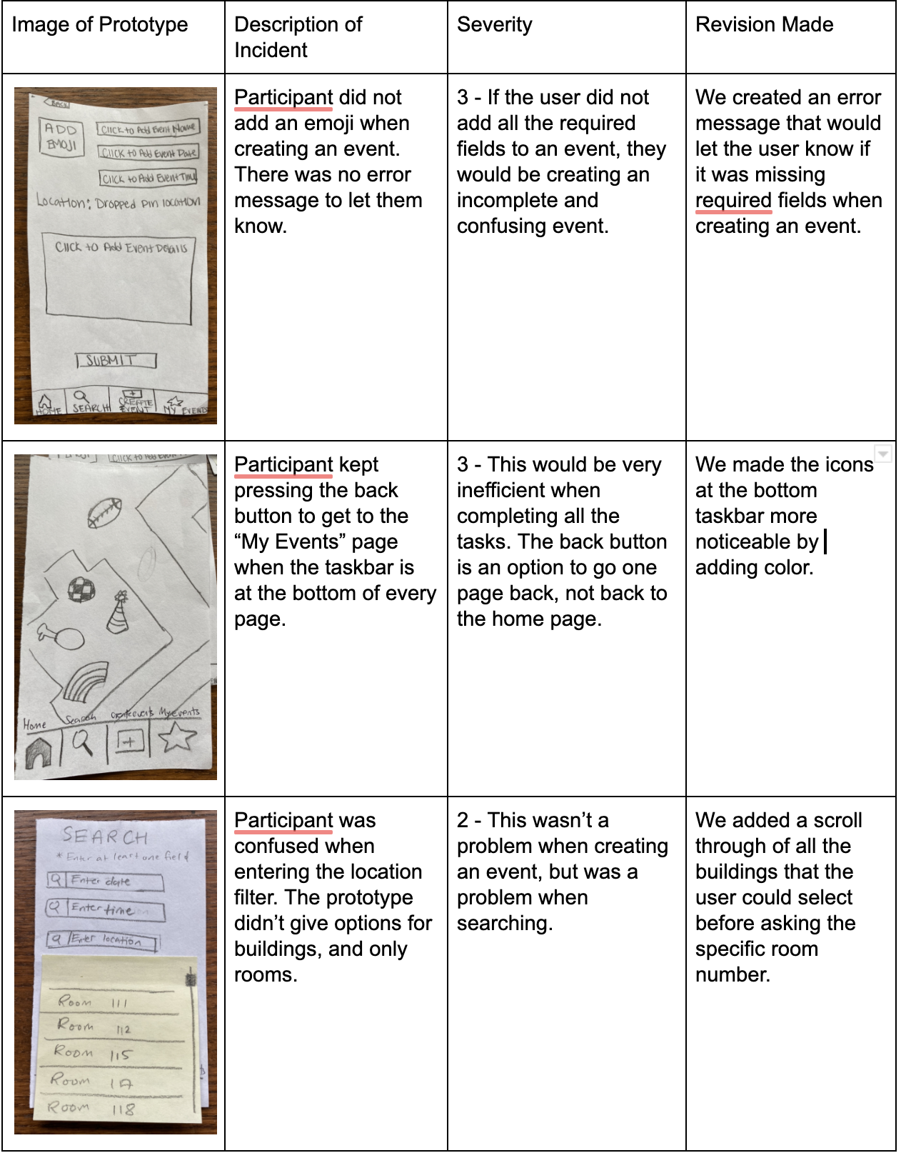
After the test, we realized both features had revisions that needed to be made. More information of these revisions are shown in the table below.
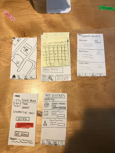
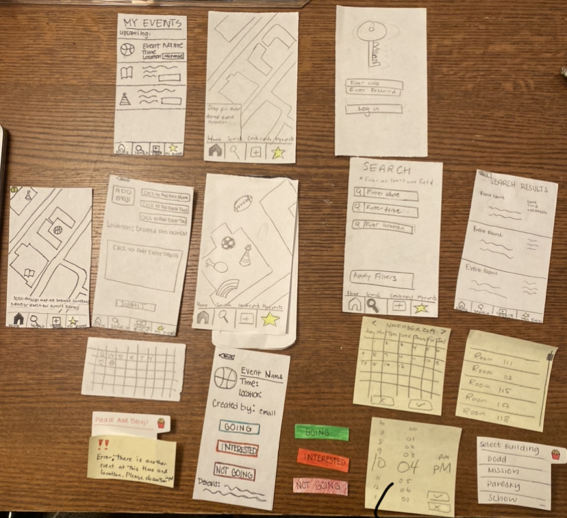
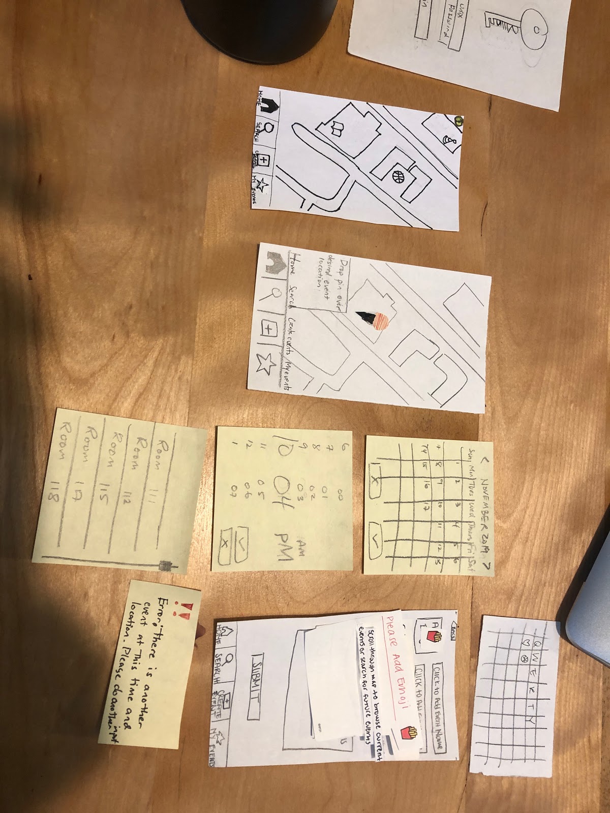
Final Paper Prototype
We made the following revisions:
-
One of our most important revisions done after this usability test was adding the error message if a required field was not completed. The participant was confused because there wasn’t an explicit error message when she tried to submit her event with empty fields. Adding this error message guarantees that a complete event is created and appeared on the map for others to see. Our participant asked what happens if they do not know the details yet. We would want our users to create an event only after full details are known so that other users aren’t confused.
-
Adding the menu bar to most of our screens throughout the app was a pretty significant revision because it not only affects almost every part of our prototype but it also allows the user to access all parts of our app at any moment (regardless of the screen that they are on).
-
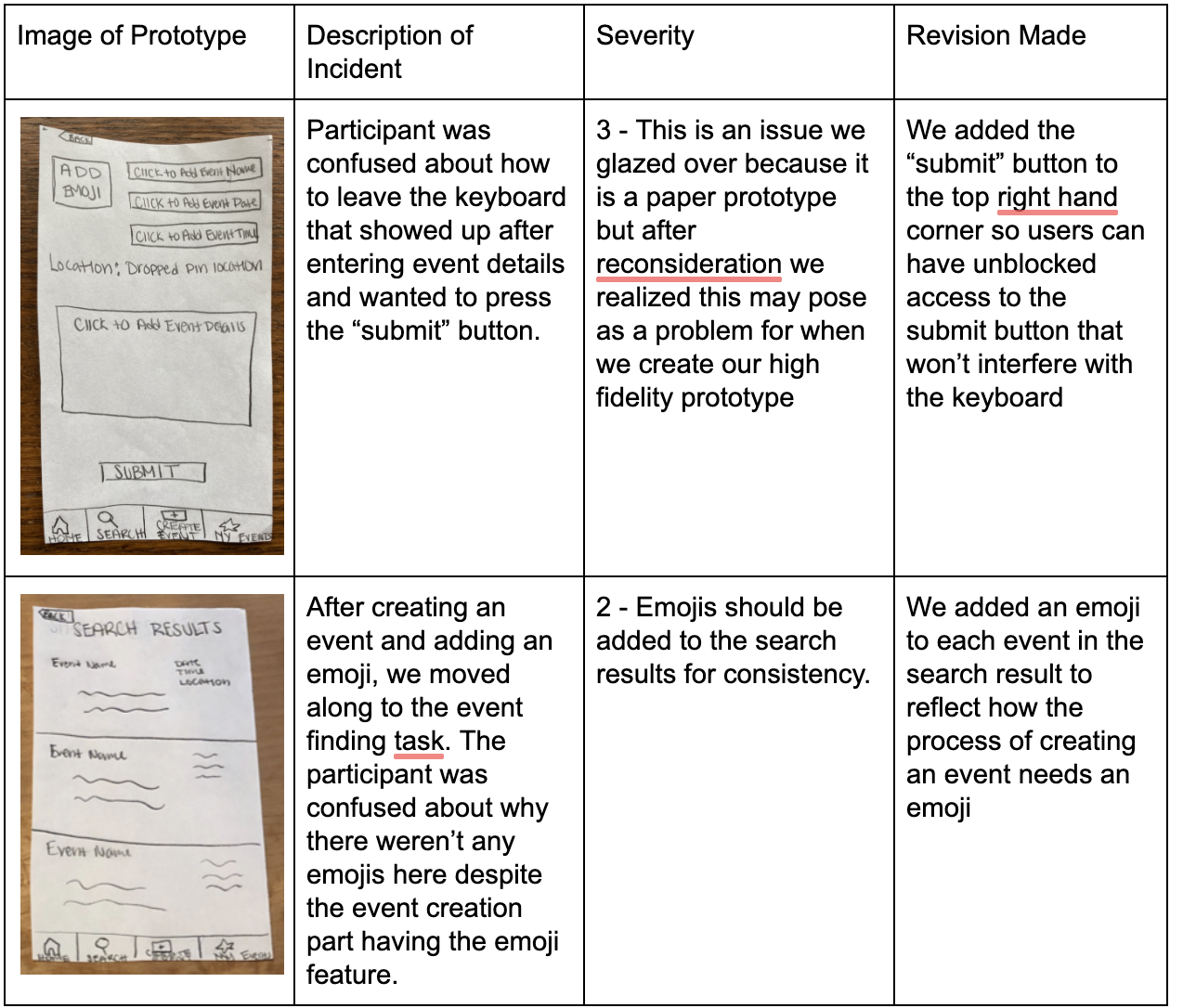
Adding a submit button to the upper right-hand corner of the create event screen since users may get confused about how to access the submit button when they are typing (the keyboard blocks off the bottom screen which is where the submit button currently is). Task 1: Creating an Event
Task 2: Searching for an Event