Heuristic Evaluations Overview
Hailey and Nyla facilitated the evaluation for Edwin. Gavin facilitated the evaluation for Gaurnett and Rudy.
Images of the Current Problematic Paper Prototype
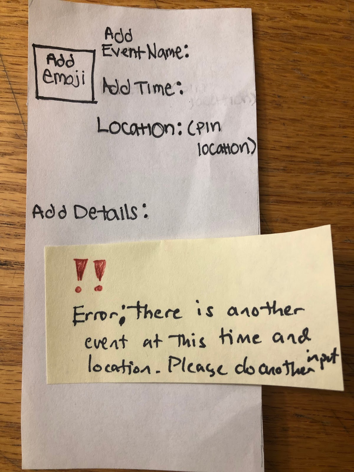
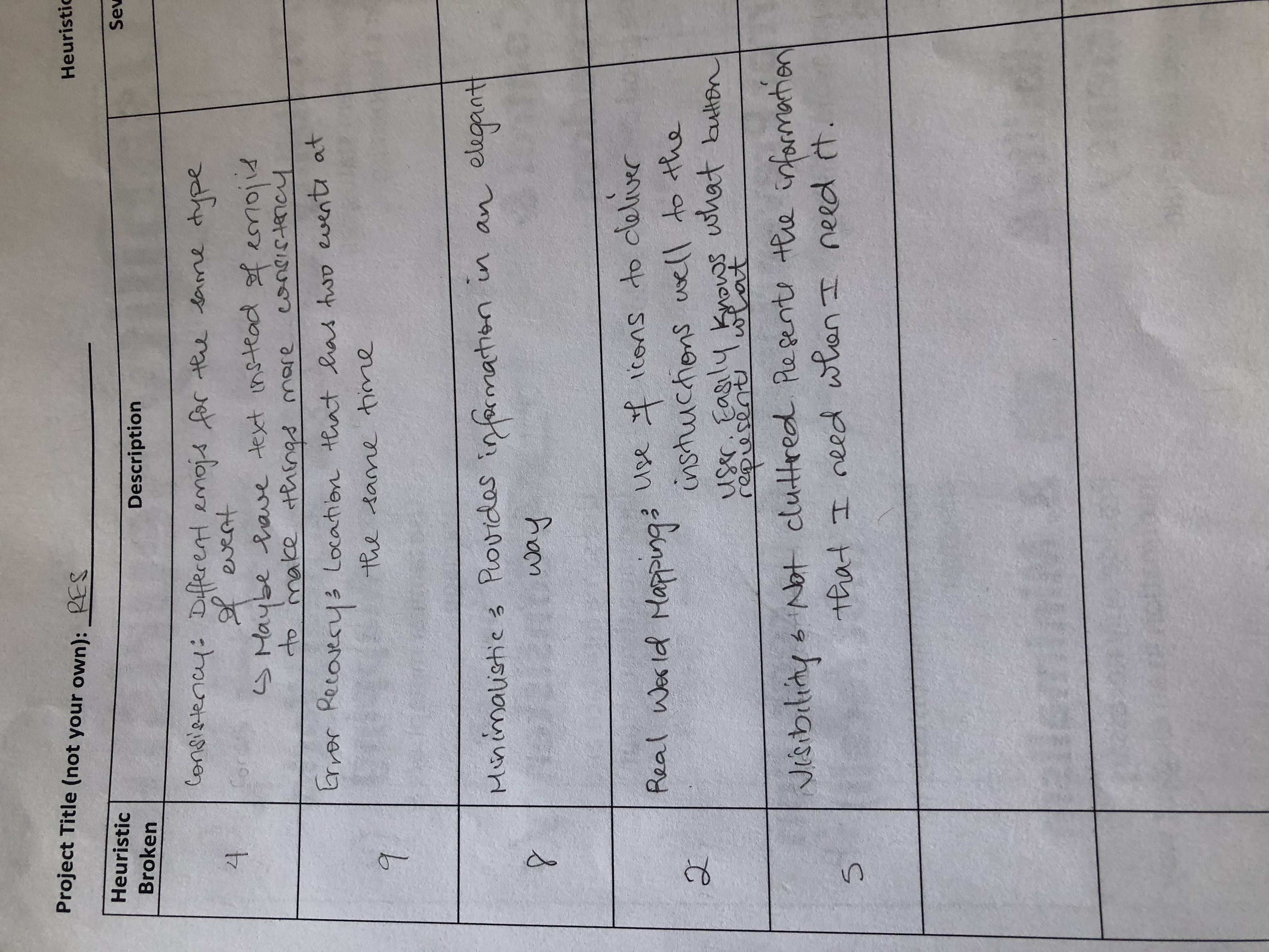
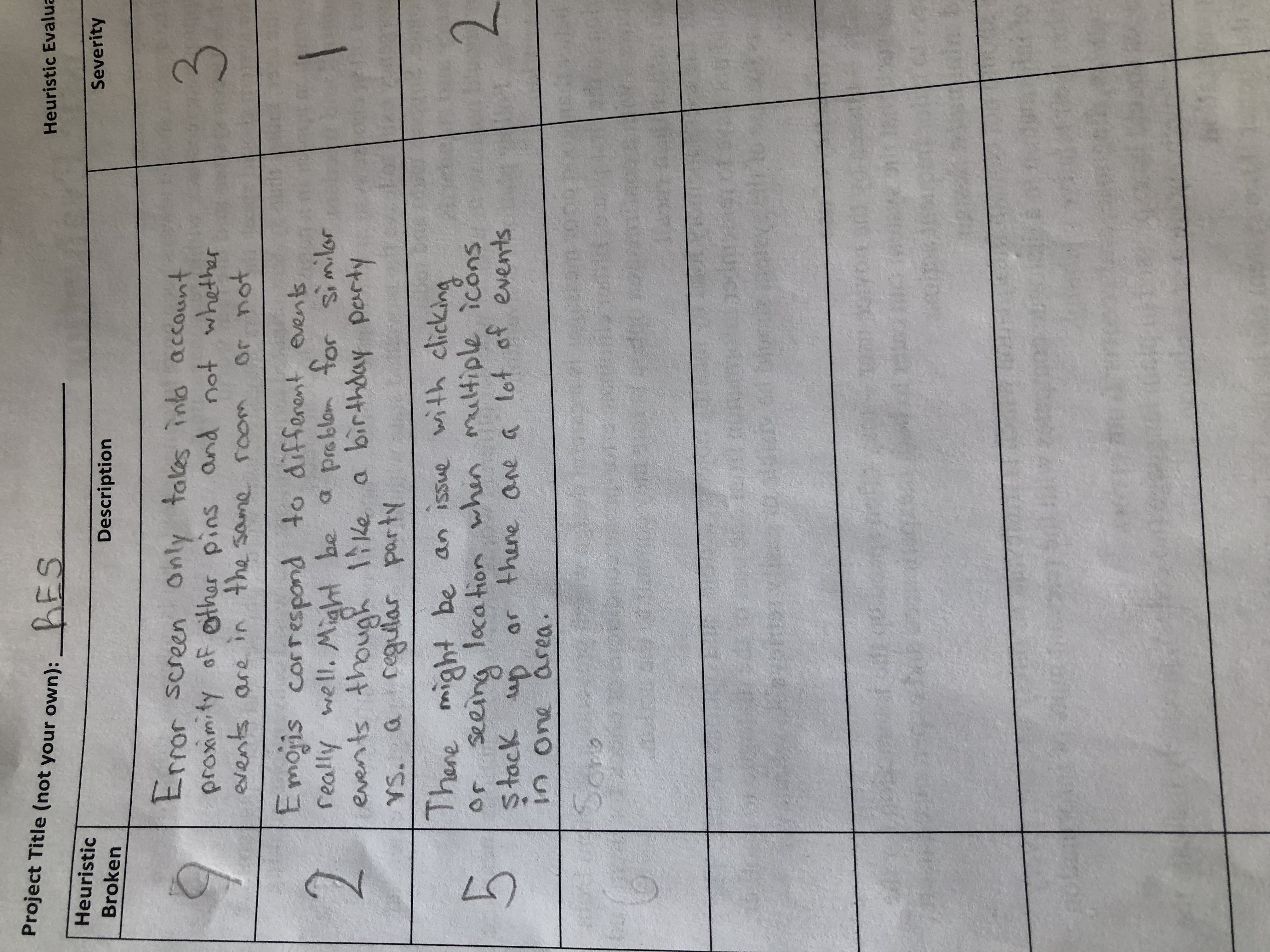
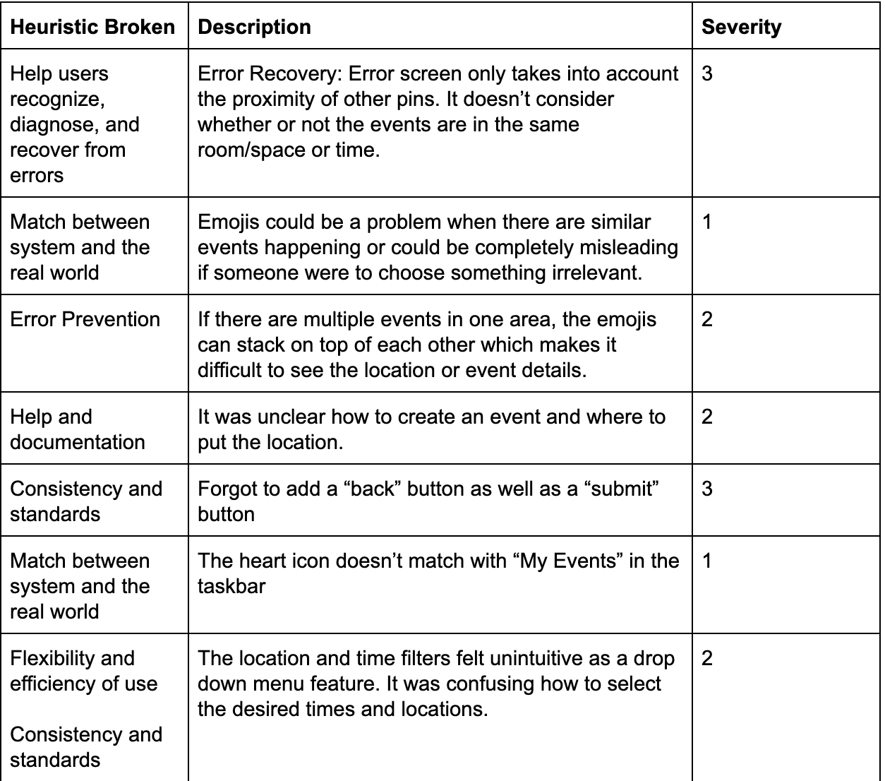
Error screen only takes into account the proximity of other pins. It doesn’t consider whether or not the events are in the same room/space or time.
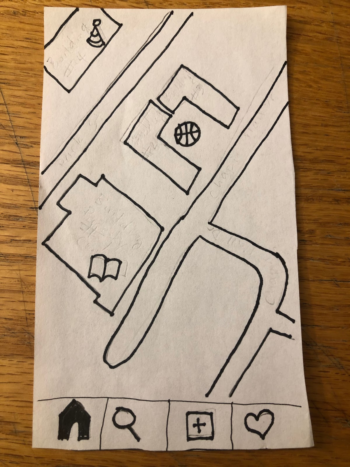
Emojis could be a problem when there are similar events happening or could be completely misleading if someone were to choose something irrelevant. If there are multiple events in one area, the emojis can stack on top of each other which makes it difficult to see the location or event details.
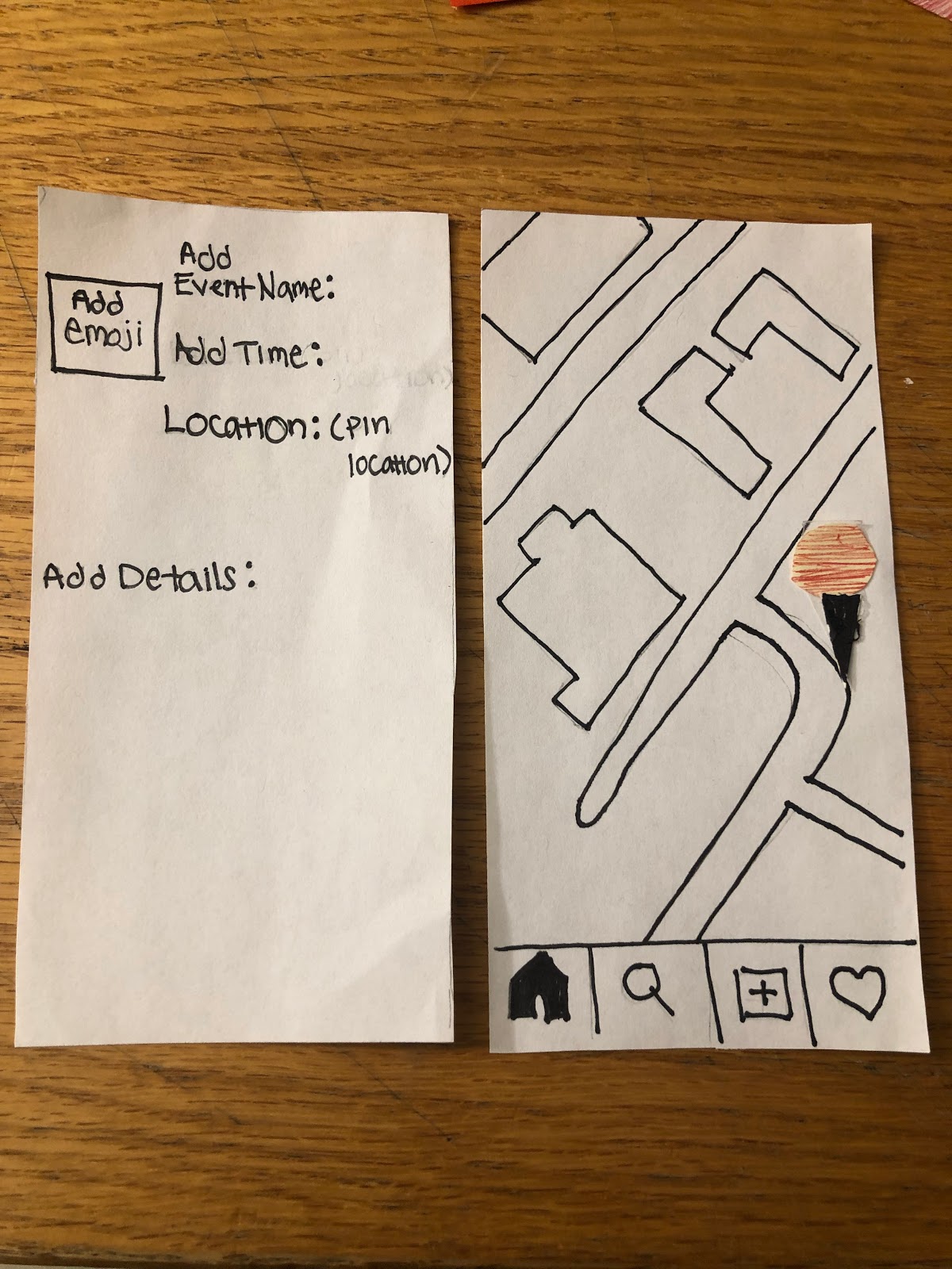
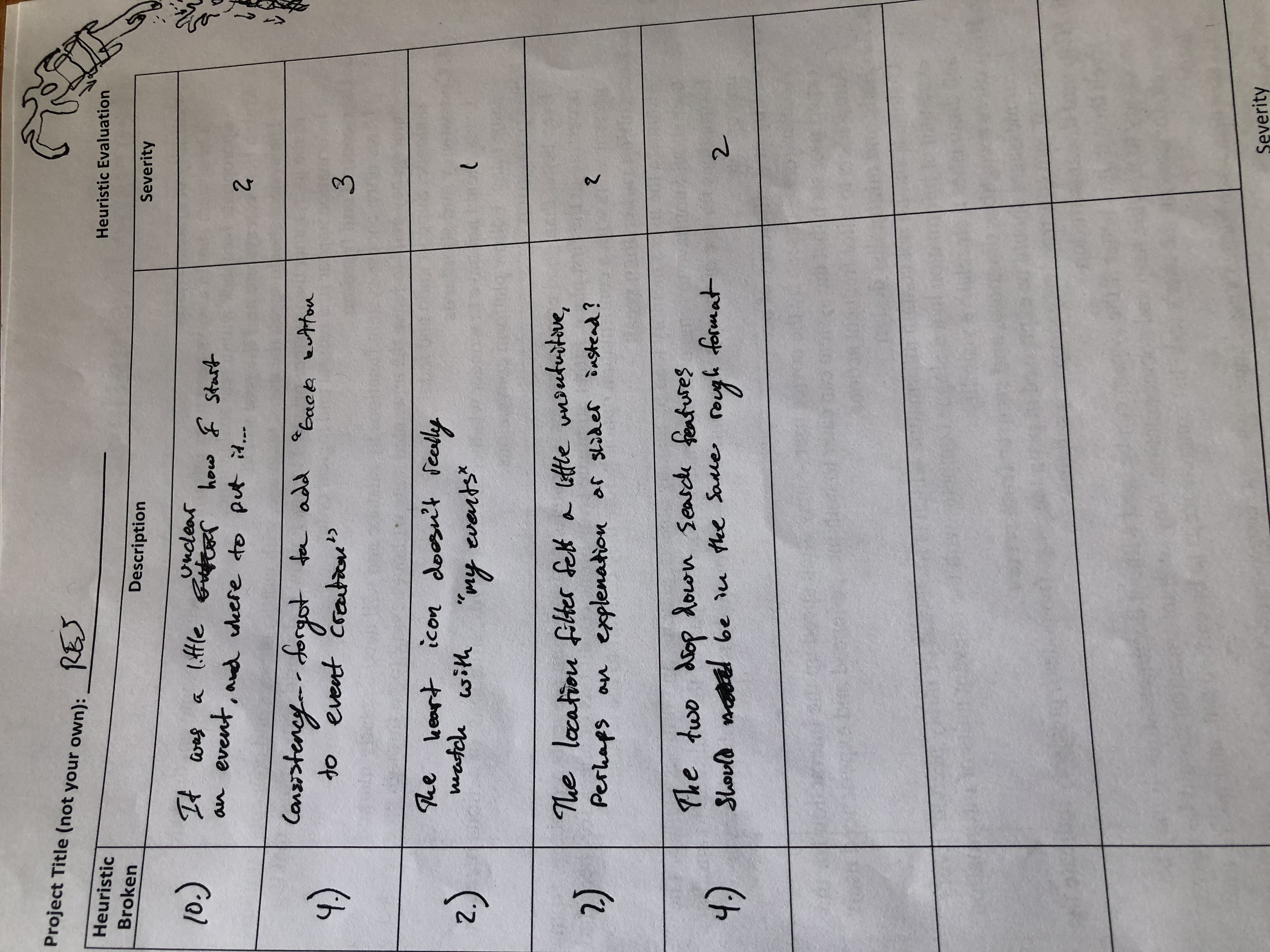
It was unclear how to create an event and where to put the location.
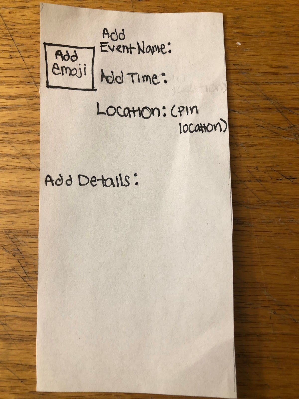
Forgot to add a “back” button as well as a “submit” button.
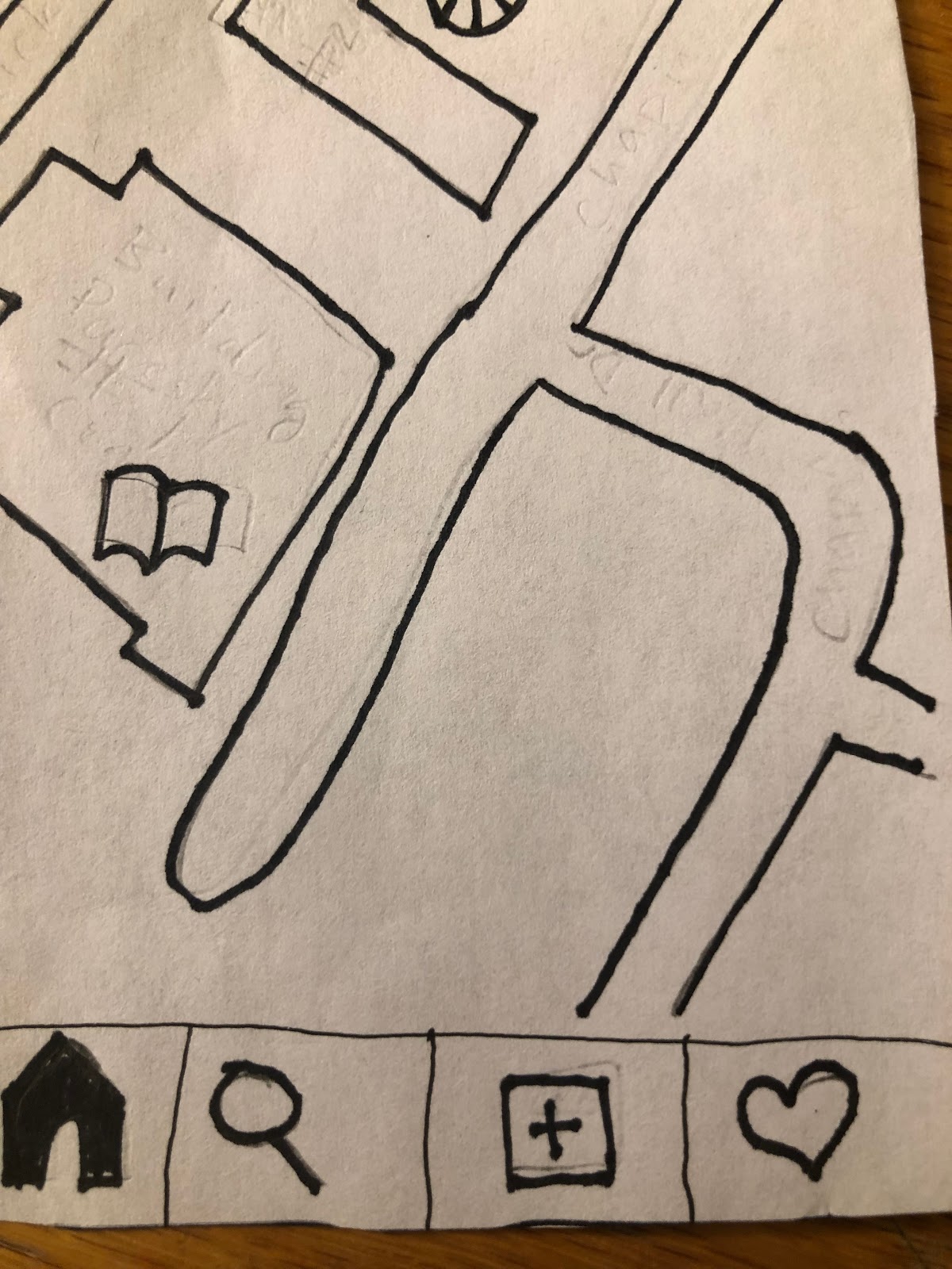
The heart icon doesn’t match with “My Events” in the taskbar.
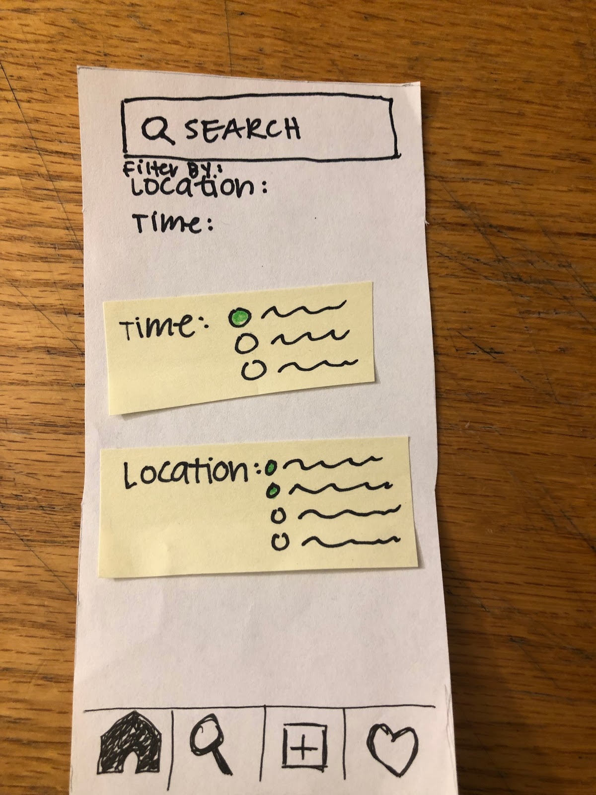
The location and time filters felt unintuitive as a drop down menu feature. It was confusing how to select the desired times and locations.
Revision Overview
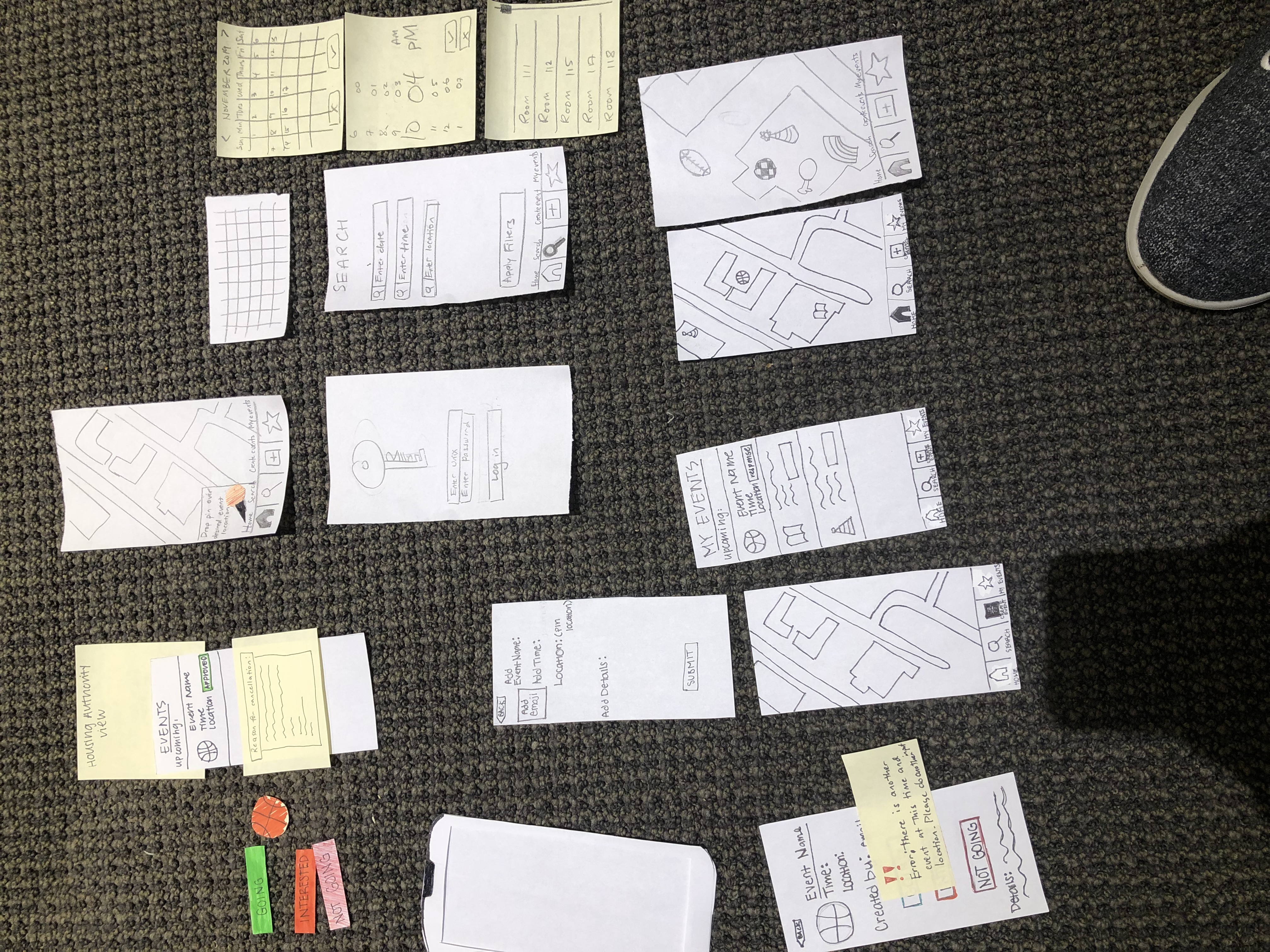
Revision Explanations
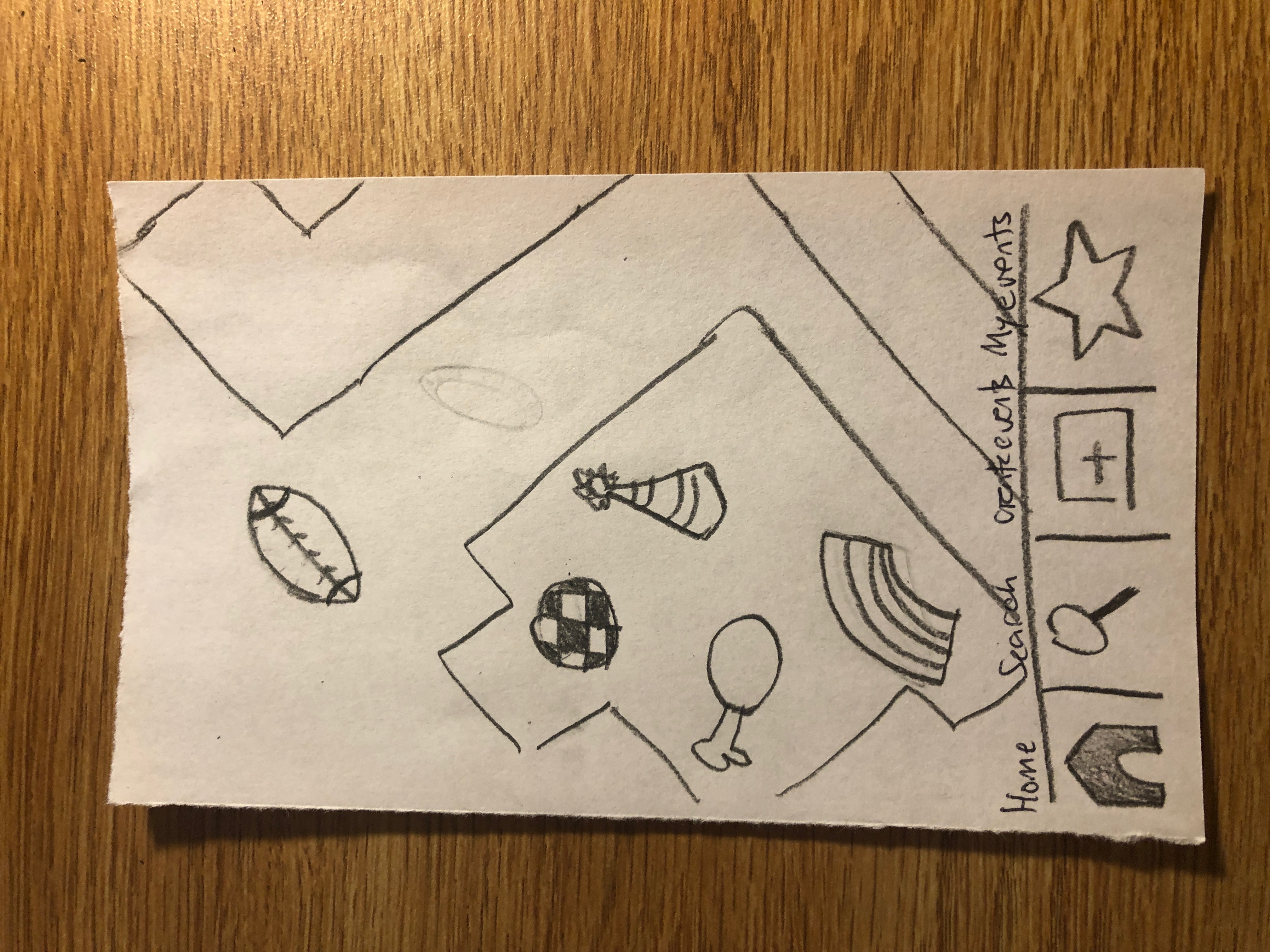
We found a way to better represent our zoom in and out features using our paper prototype by creating a screen that is representative of the way the map would look if zoomed into a specific building (showing the building floor plan of rooms). We did this to solve the potential problem of emoji crowding where there are multiple events visually represented on the RES map in the same locations. However, we do not predict this being too much of a problem since the map is only representative of events that are currently happening while future events can be found through the search option.
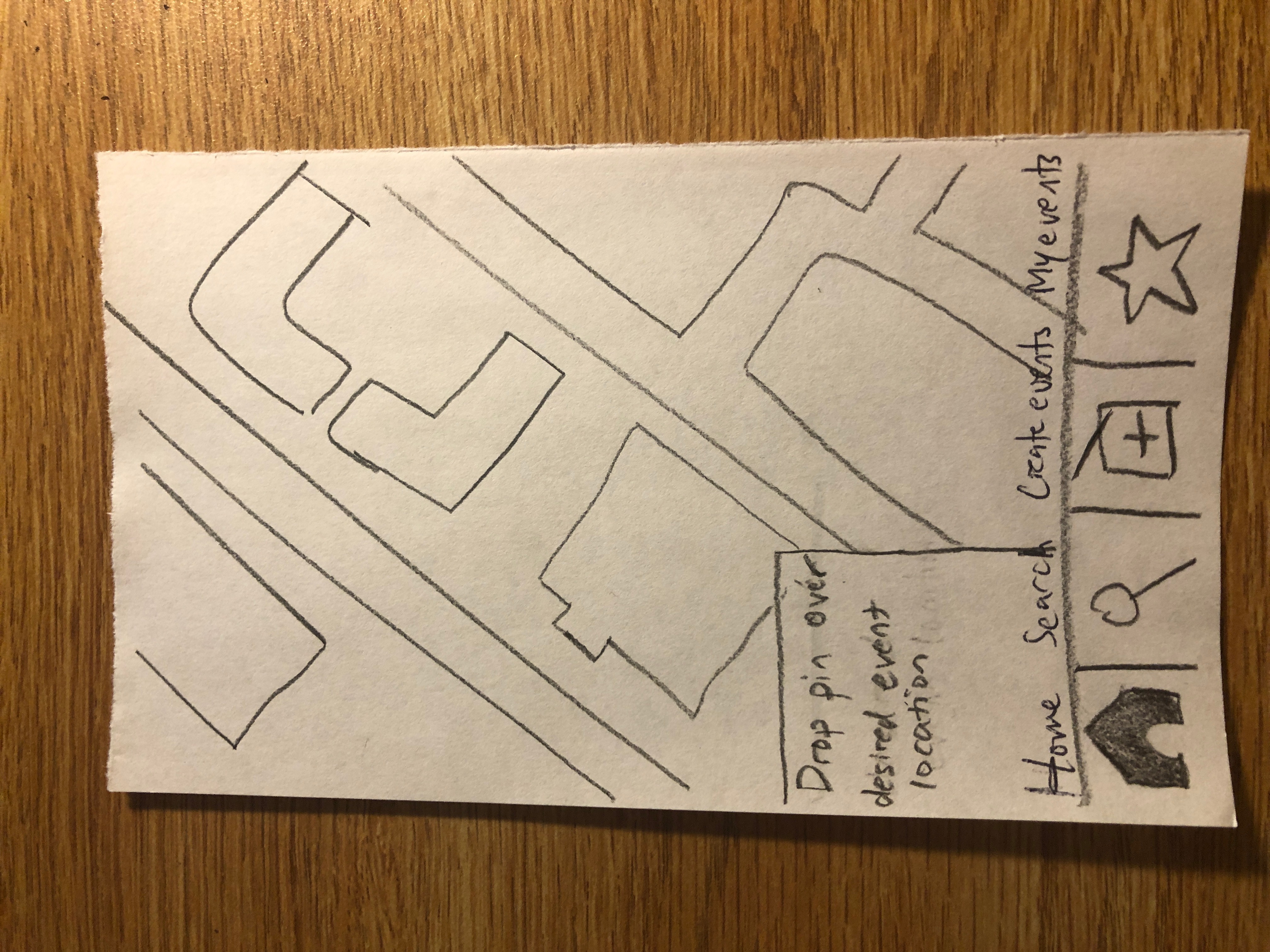
We added a box for the pin and instructions on functionality to the screen when a user decides to create an event (this screen is shown after the plus icon is clicked).
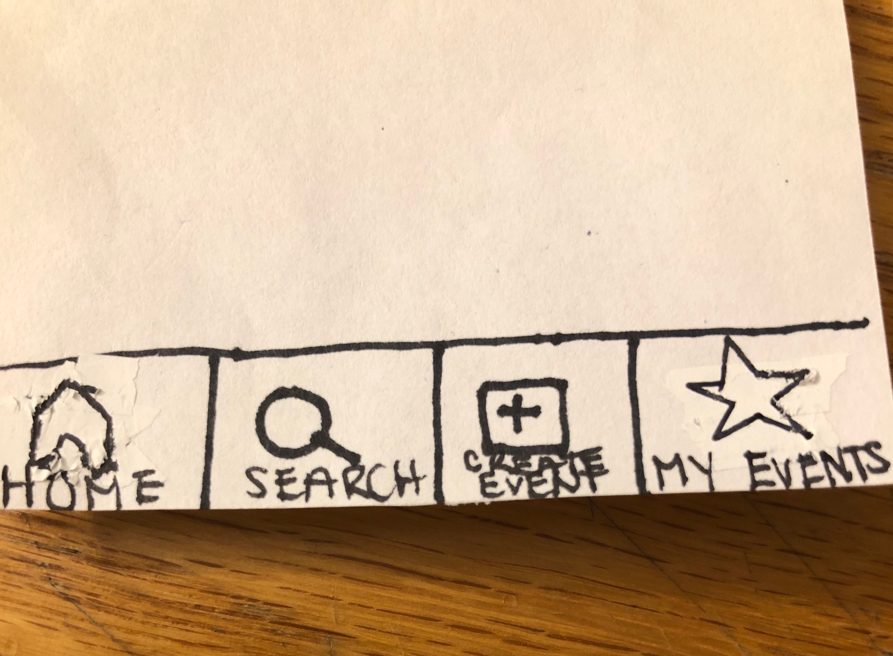
We added labels to our menu bar on the bottom of our interface to eliminate confusion with direct mapping of the images to their meaning.
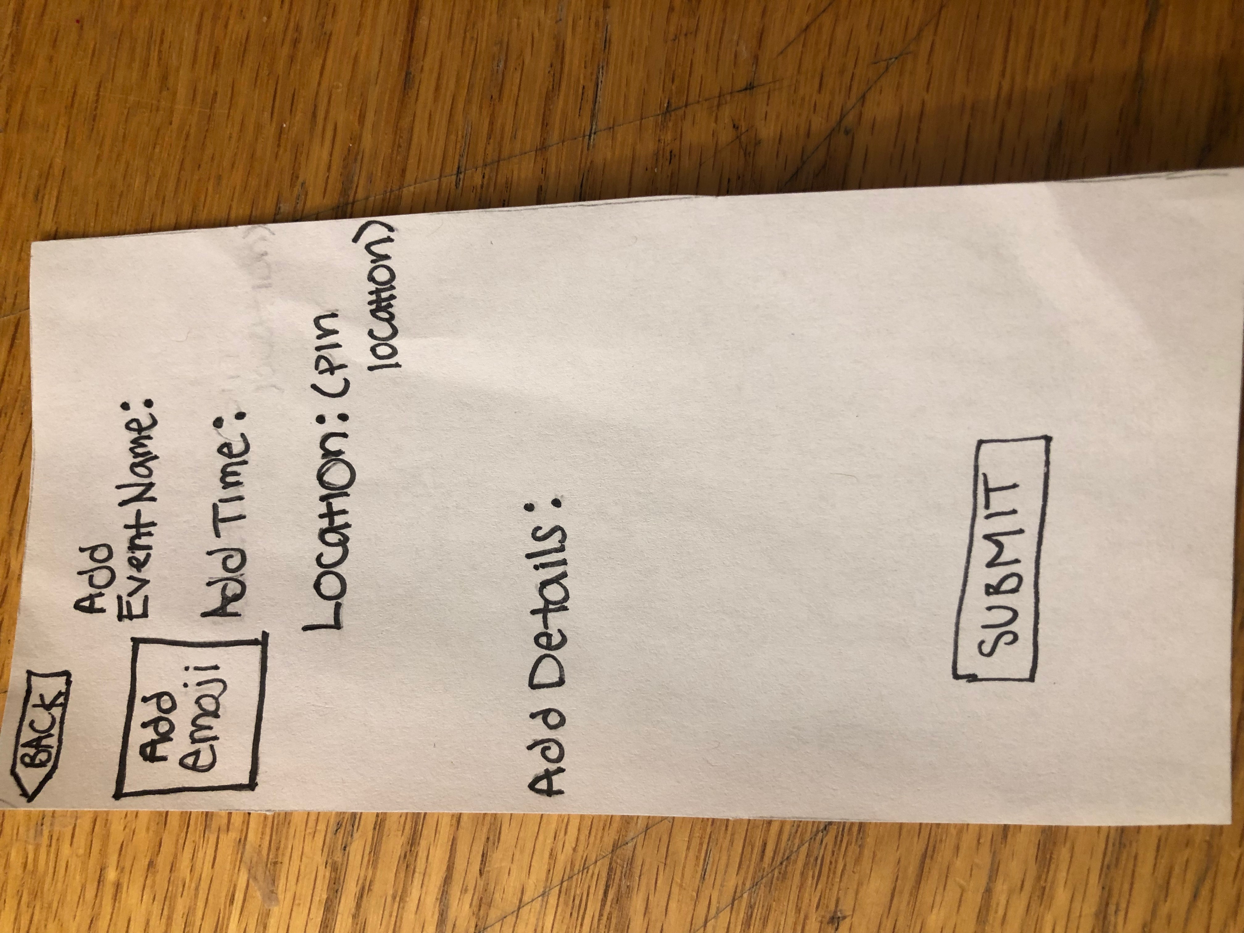
We added both “back” and “submit” buttons to our screen used to create an event to help with the functionality of our application.

We decided to change our heart icon on our menu bar to a star to better represent “My Events” as events that are favorited in a sense due to user attendance response of “going” or “interested”.
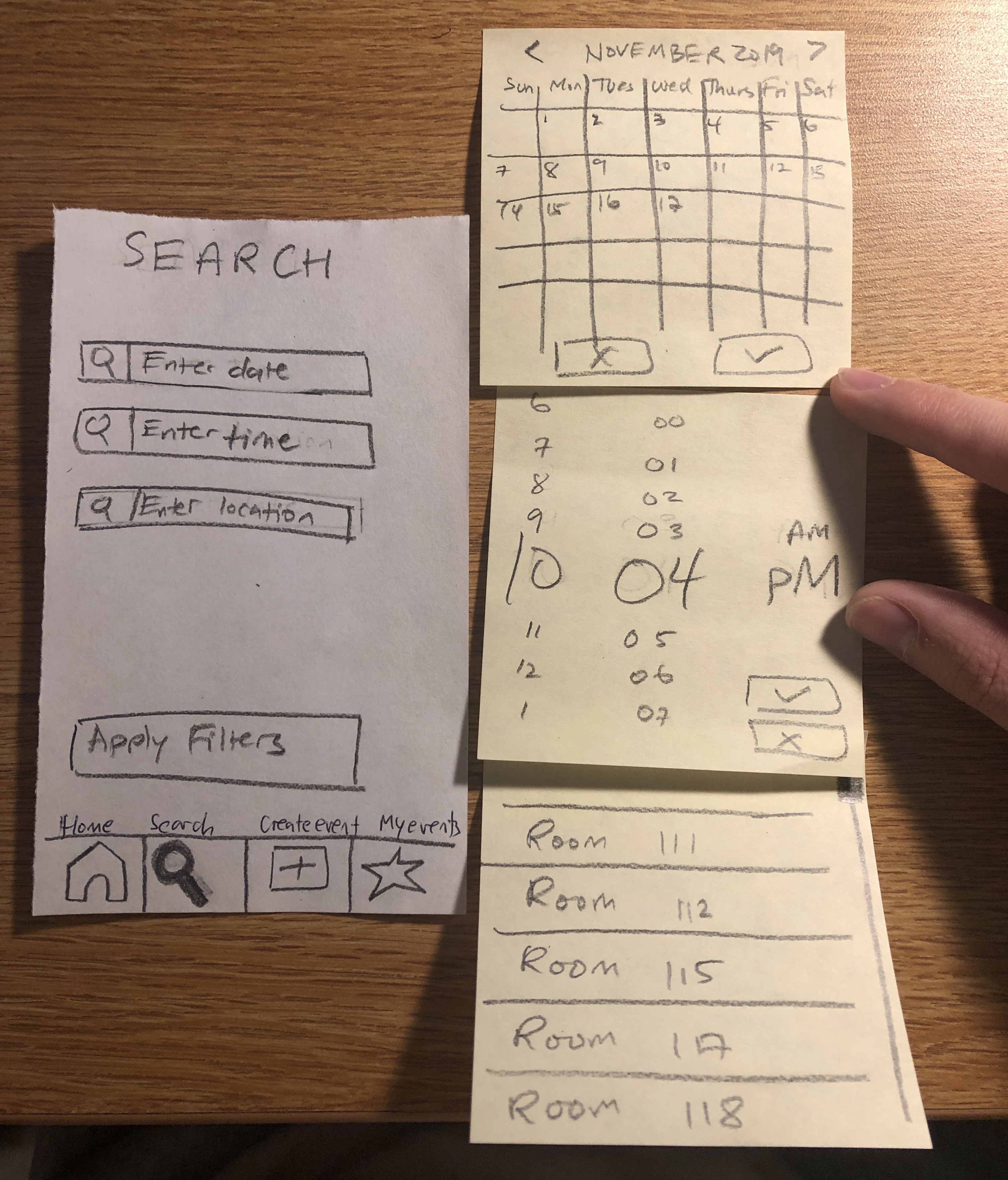
We changed the location and time filters that assisted with searching for future events to text boxes that users can click on, and also added a “date” text box as well. The “date” text box directs users to a calendar pop up where they can click on the appropriate date. The “time” text box directs you to a pop up where you can scroll through numbers to indicate the desired time. And lastly, the location text box directs users to a pop up where users can scroll through different locations. Theses changes more clearly help the user accomplish the task of searching for future events.
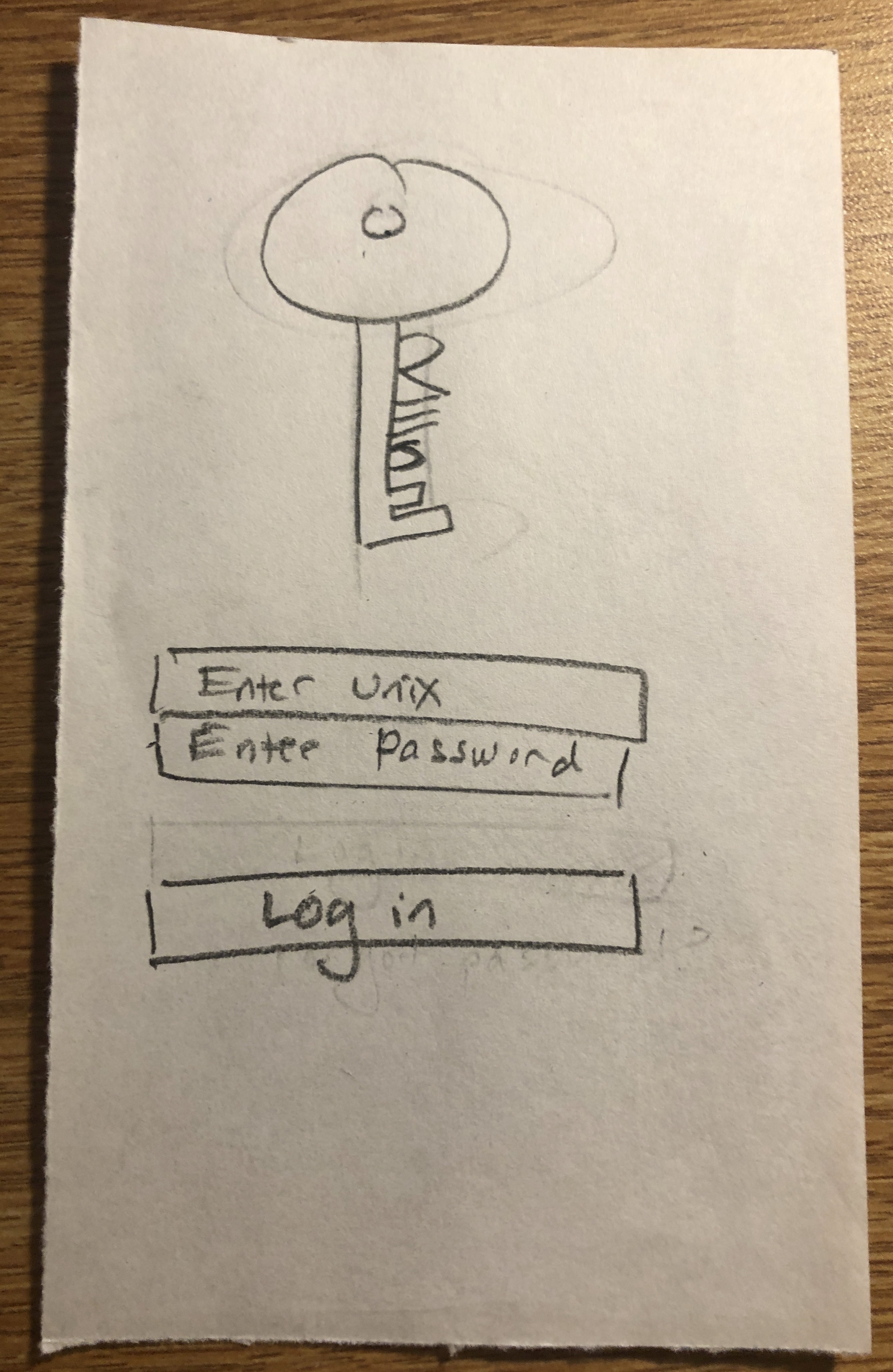
We created a login screen to help us identify whether or not the users are housing authorities or not when using the application.
Paper Heuristic Evaluations
